
Mannen met Pannen
Brand Identity Redesign / Visual Design
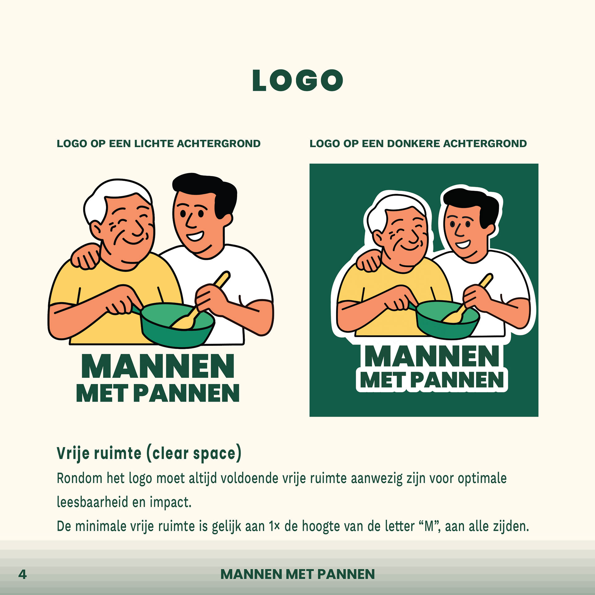
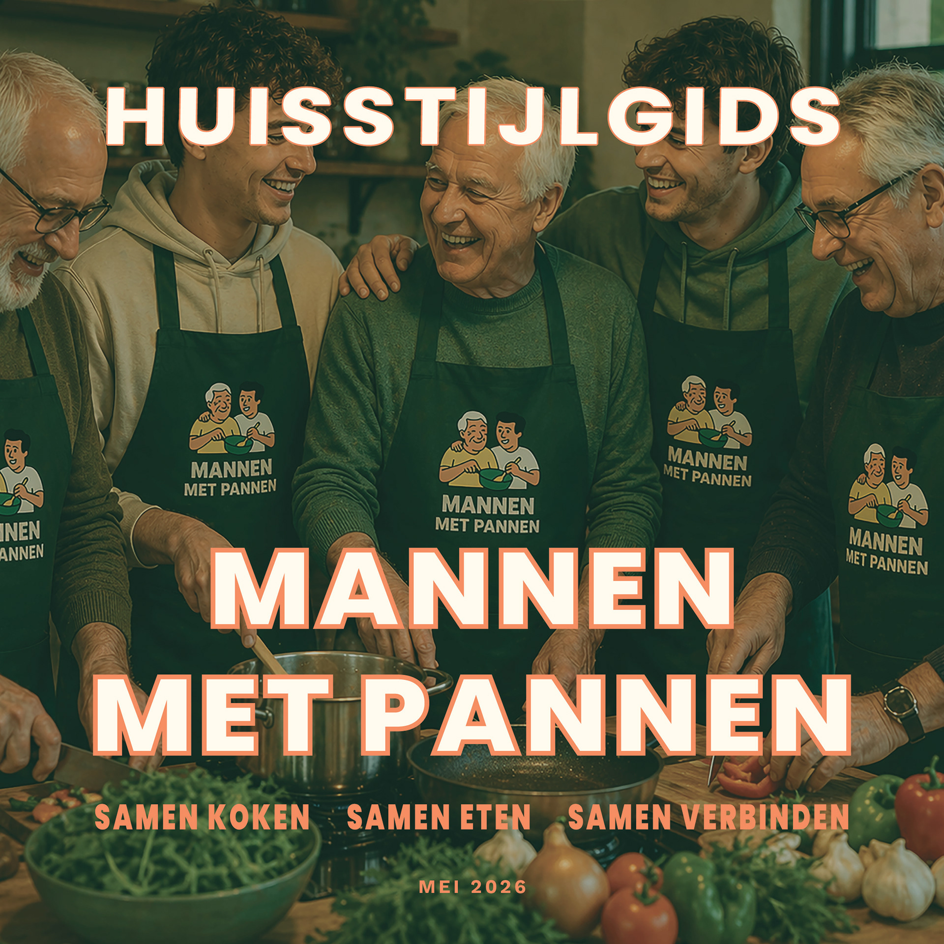
Mannen met Pannen is a foundation from Groningen that brings men aged 55+ and students together around the shared experience of cooking and dining. With the motto “Samen koken, samen eten, samen verbinden” (Cooking together, eating together, connecting together), the initiative creates meaningful encounters and helps reduce loneliness by building new social connections across generations.
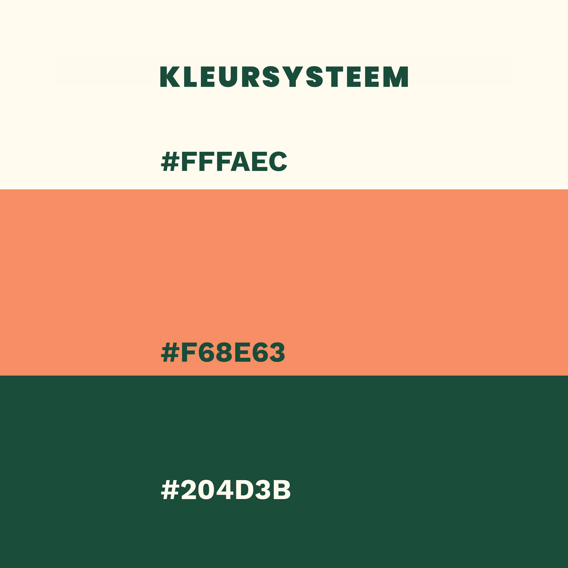
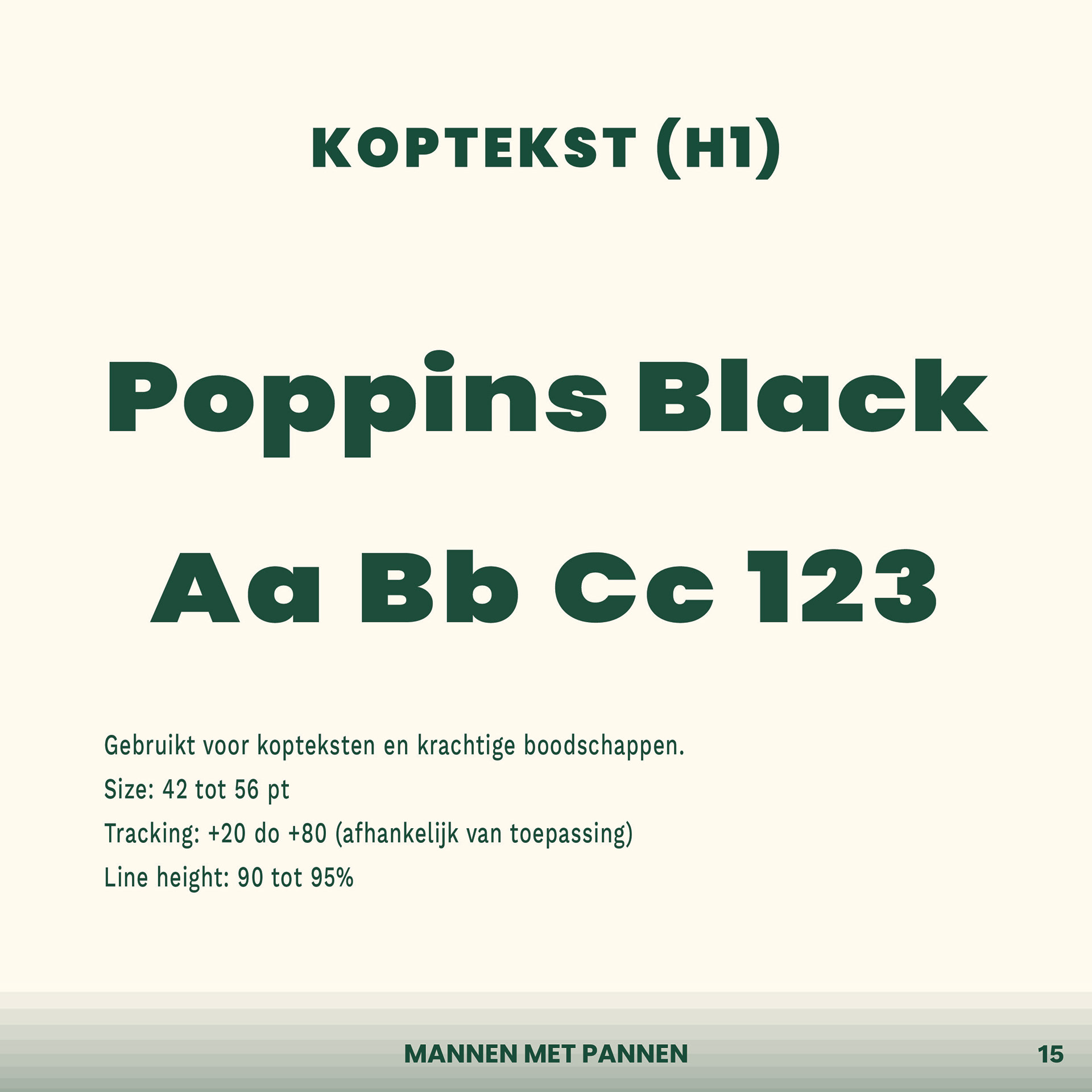
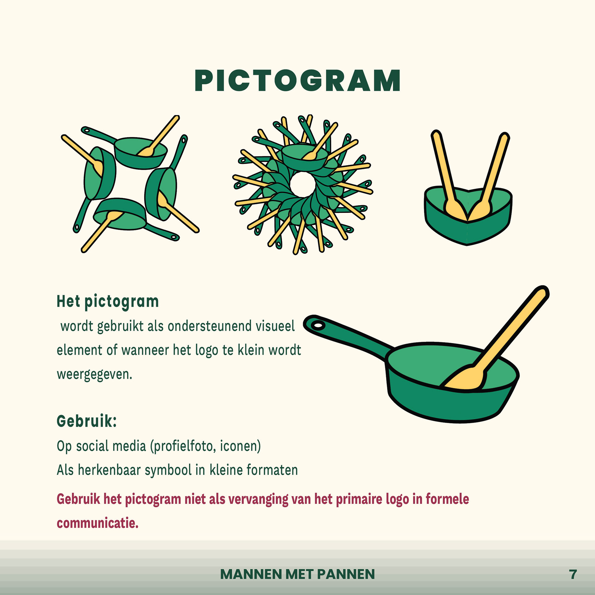
I redesigned the existing logo and developed a complete visual identity that reflects the warmth, openness, and community-driven spirit of the foundation. By creating a new color palette, typography system, tone of voice, and visual guidelines, I translated the organization’s values into a consistent and recognizable brand language.
Through thoughtful application of branding principles, grid systems, and typographic hierarchy, I created a visual identity that feels personal, approachable, and inviting — a reflection of the connections created around the table.
Responsibilities:
— Logo redesign
— Visual identity development
— Color palette & typography system
— Brand tone of voice
— Social media & print guidelines
— Grid systems & visual consistency
— Logo redesign
— Visual identity development
— Color palette & typography system
— Brand tone of voice
— Social media & print guidelines
— Grid systems & visual consistency
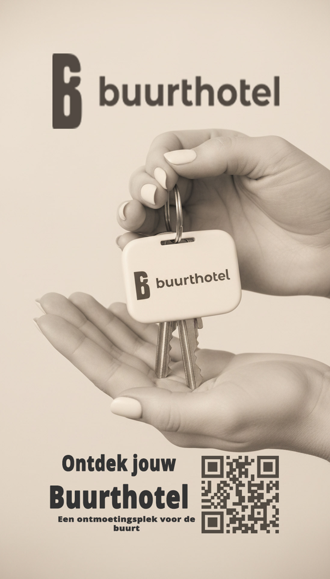
Buurthotel
Visual Campaign Design / Digital Design / Social Media
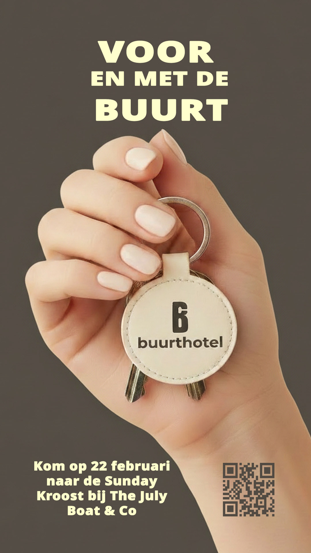
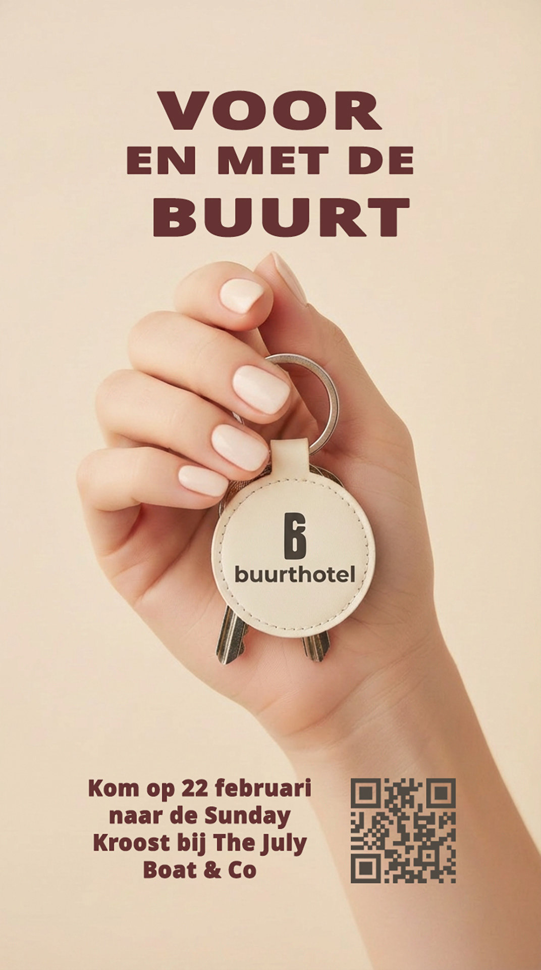
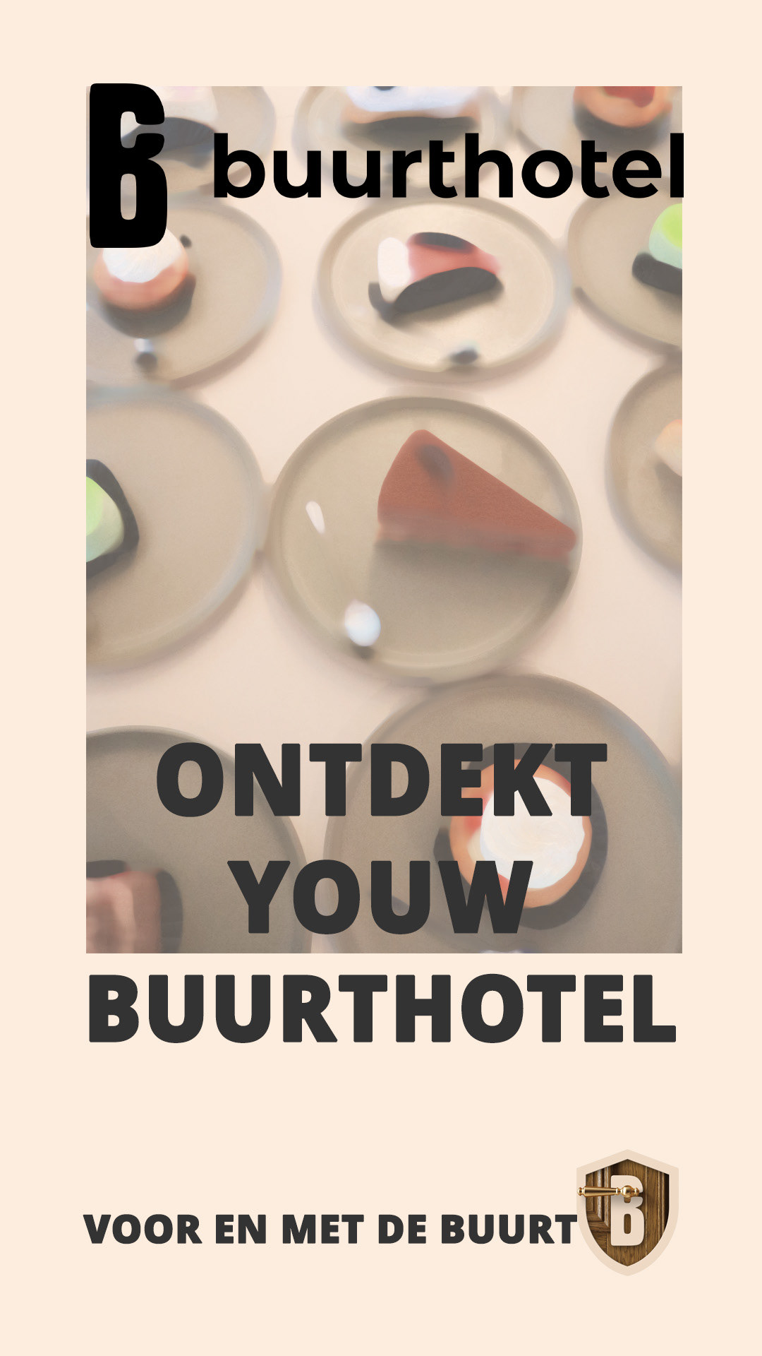
Buurthotel is a community-focused initiative built around connection and belonging. Working within the existing brand identity, I developed a series of visual concepts for social media and digital screens that communicate the idea of “Voor en met de buurt” — for and with the neighborhood.
Through human-centered visuals, thoughtful compositions, and a clear typographic system, I created campaign materials that feel welcoming, accessible, and connected to the local community. The project included exploring AI-supported tools for image creation, enhancement, and visual experimentation, integrating new possibilities while maintaining brand consistency.
The final designs create a cohesive digital campaign that strengthens Buurthotel’s message of community, interaction, and shared experiences.
Responsibilities:
— Campaign concept & visual design
— Digital and social media design
— Image editing & AI-assisted visual exploration
— Layout & typography
— Campaign concept & visual design
— Digital and social media design
— Image editing & AI-assisted visual exploration
— Layout & typography
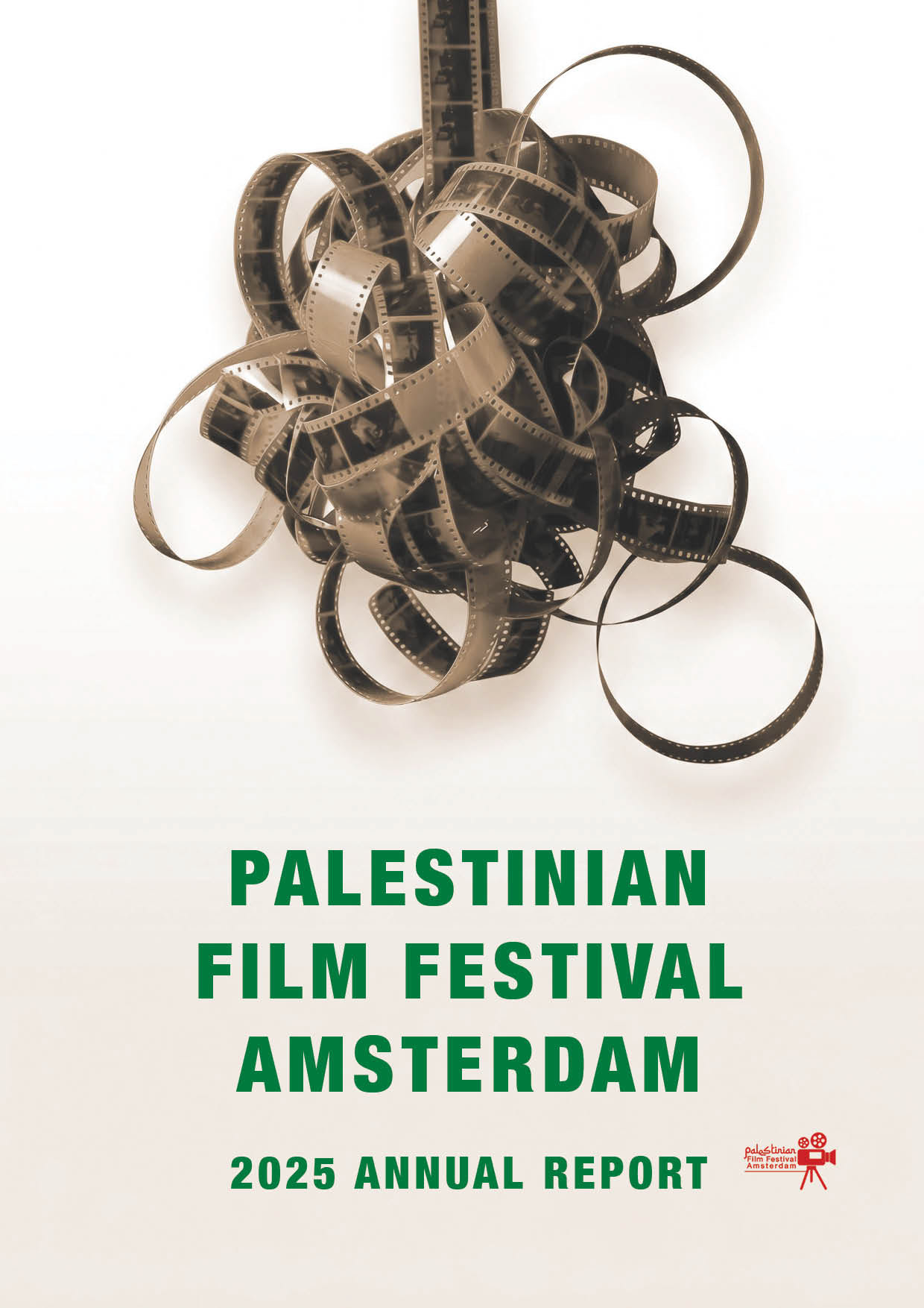
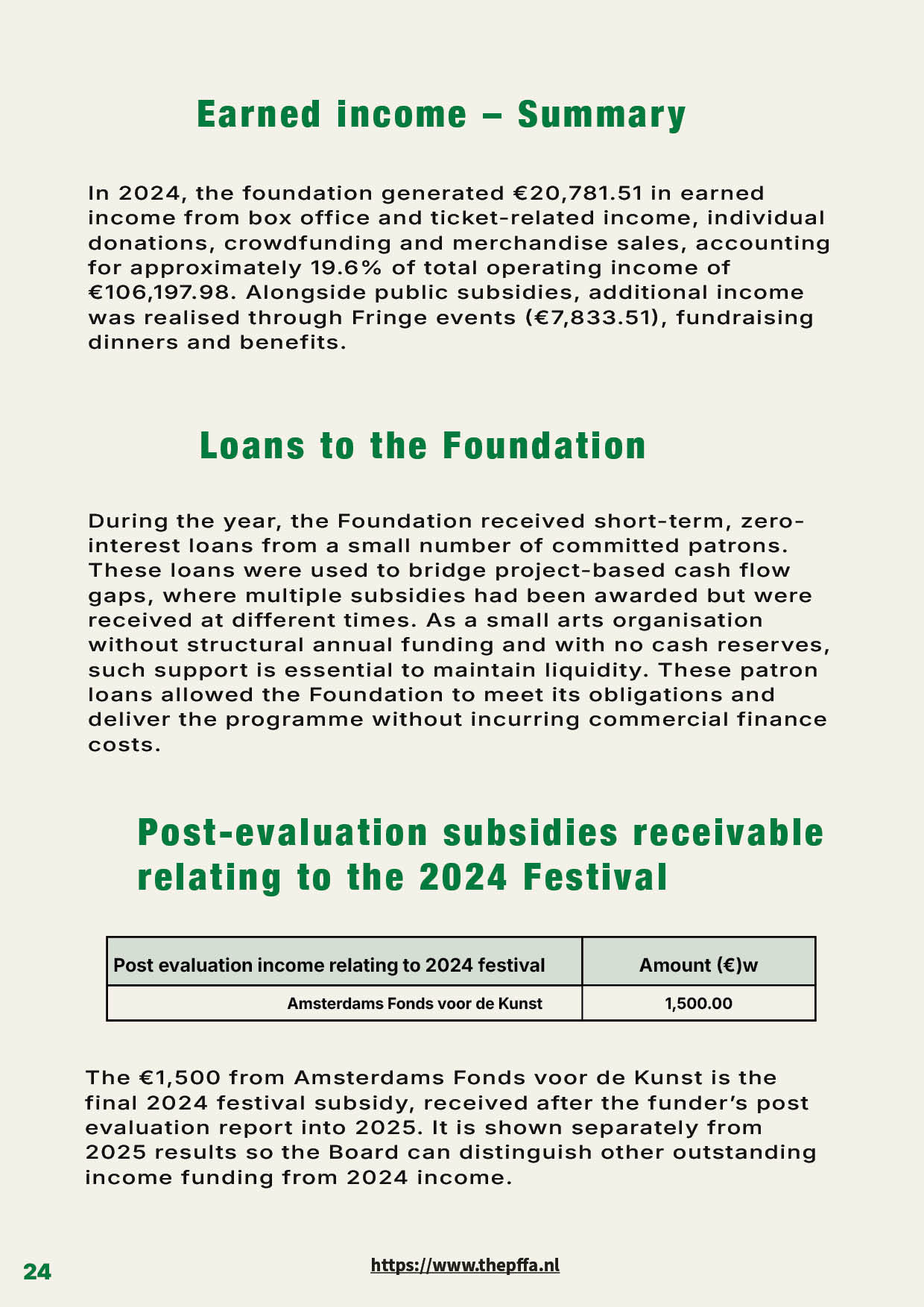
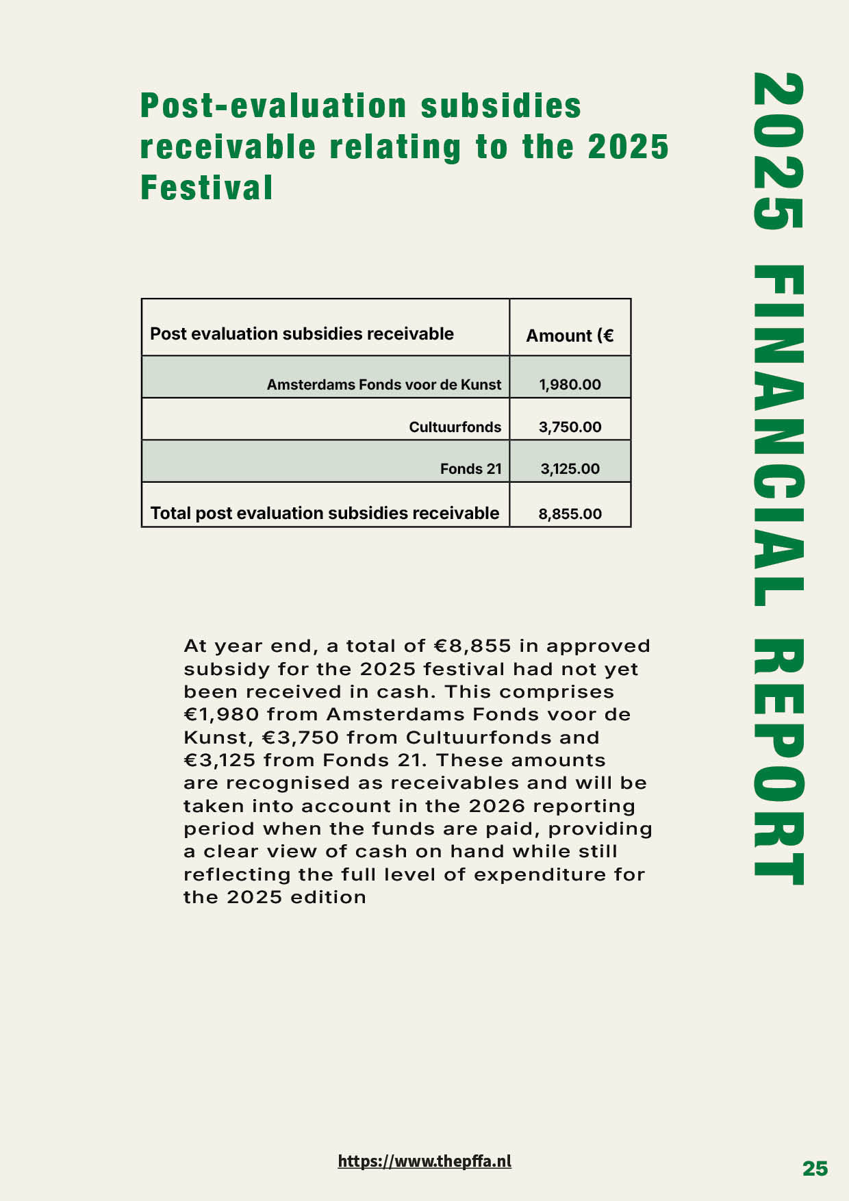
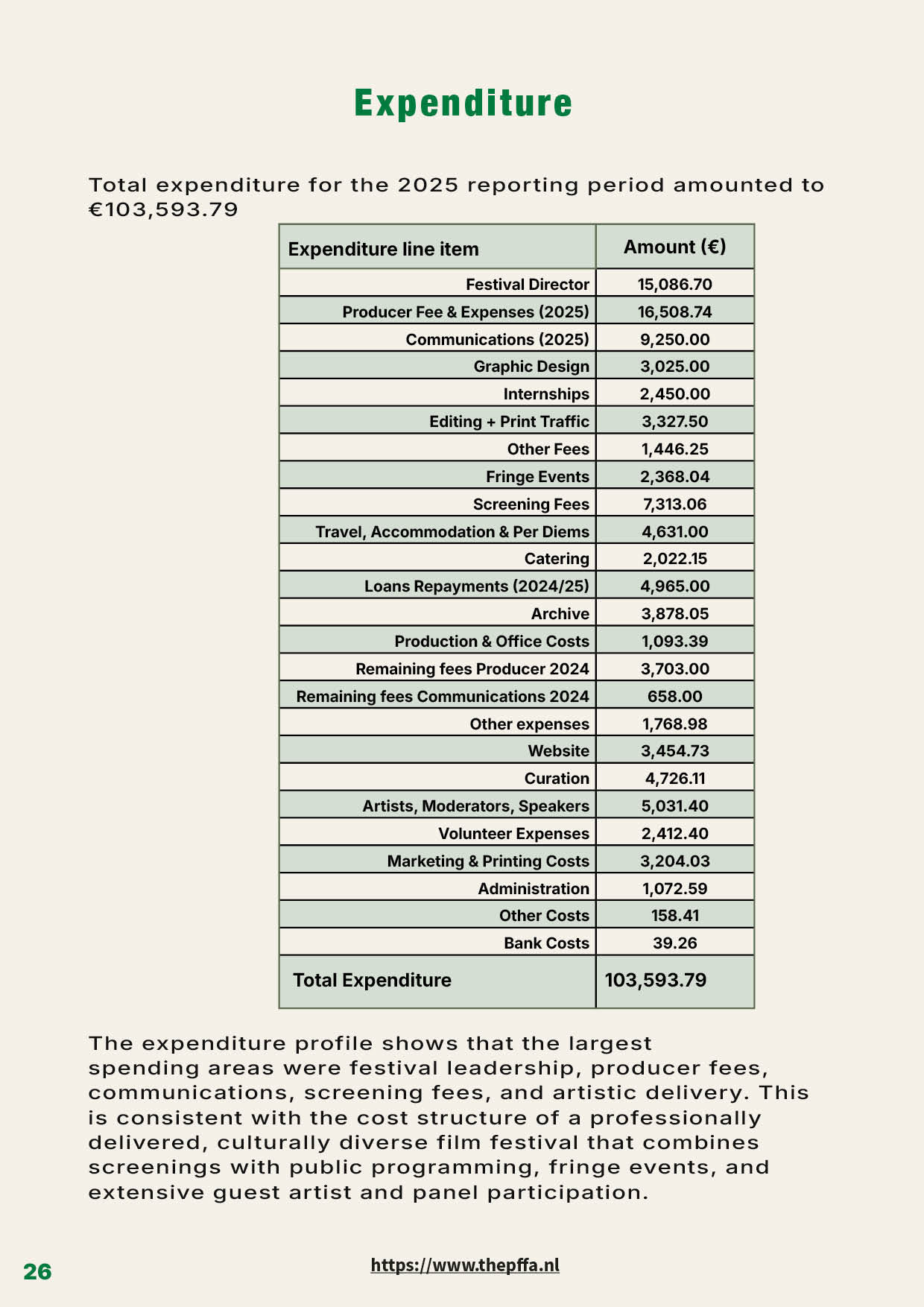
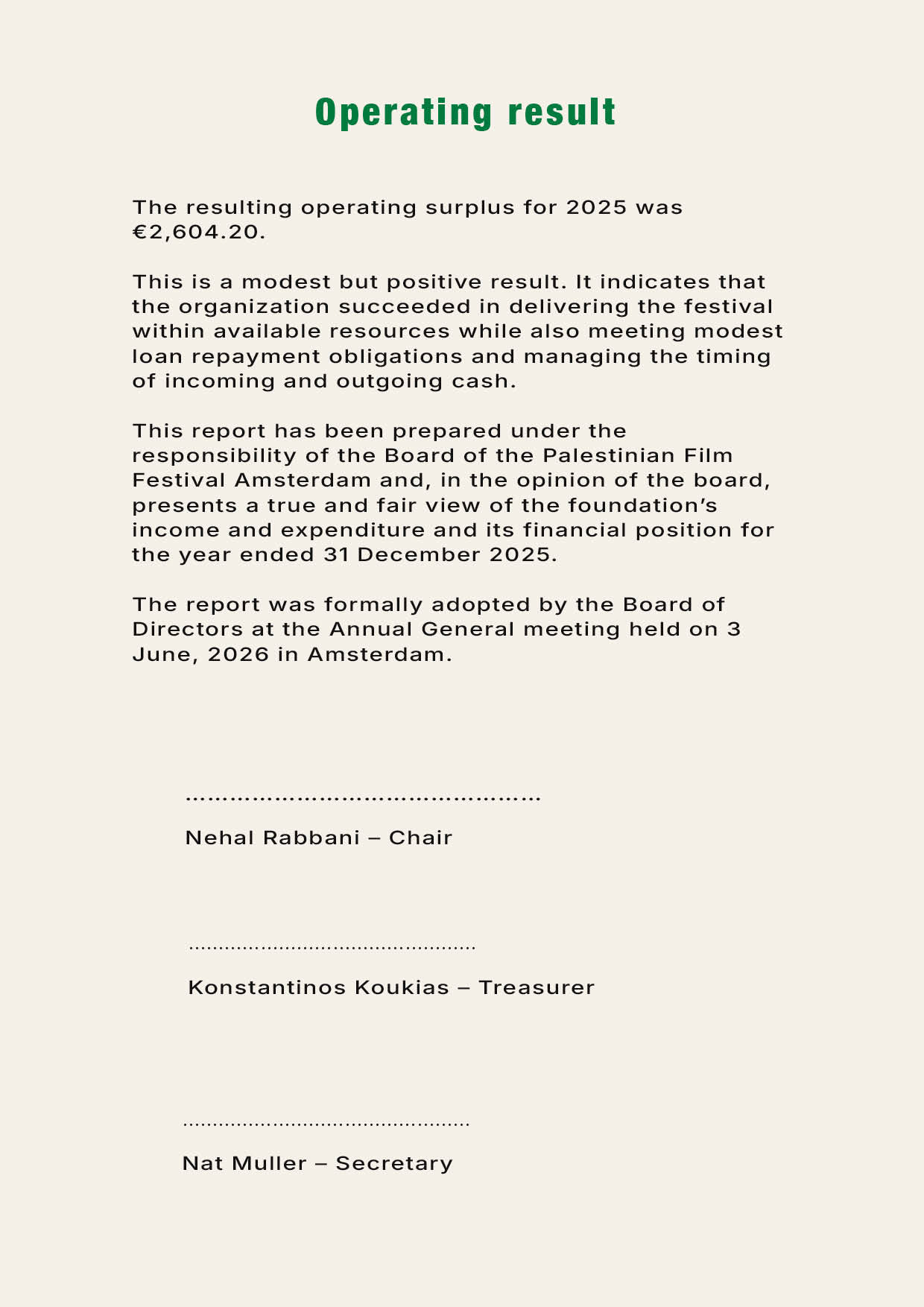
Palestinian Film Festival Amsterdam
– Annual Report 2025
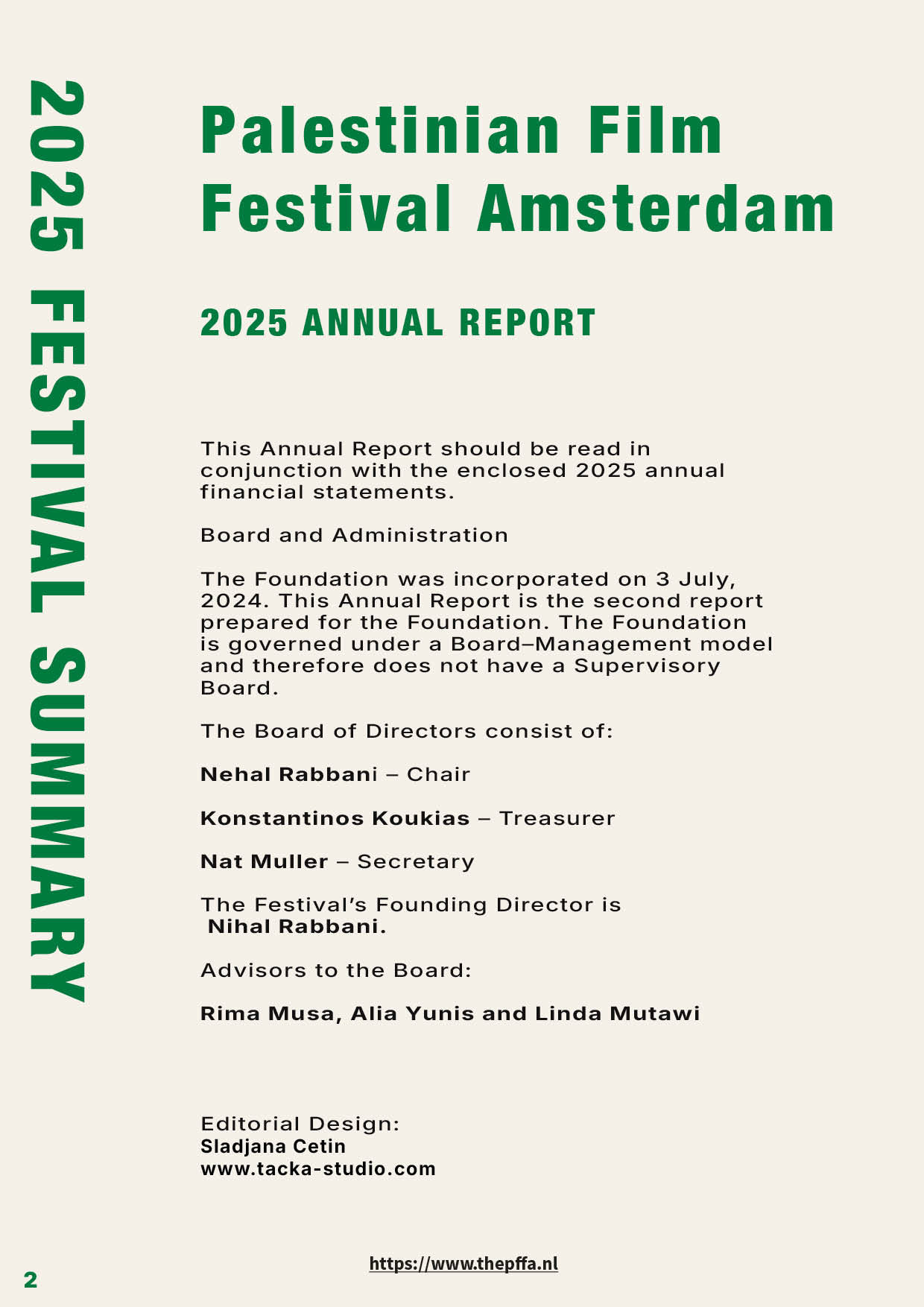
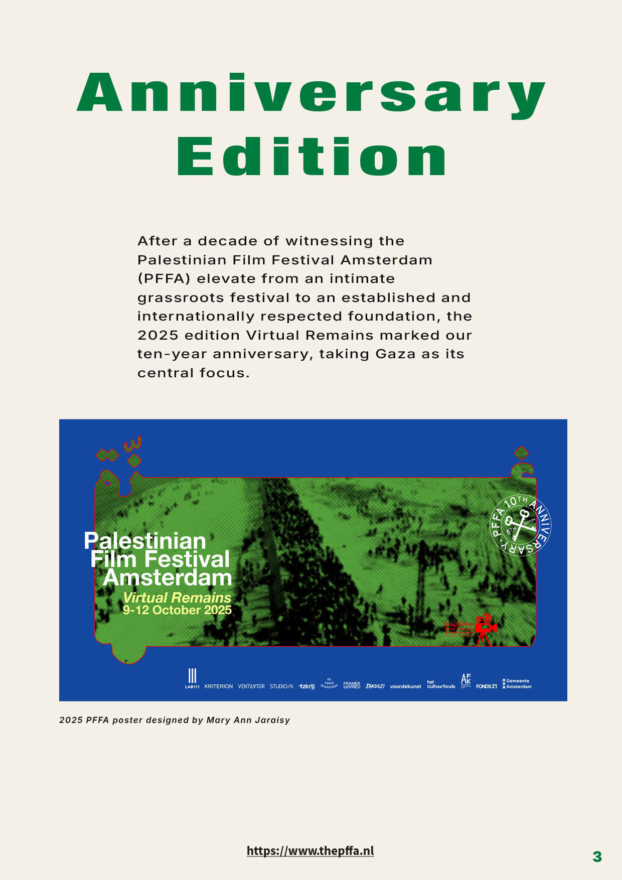
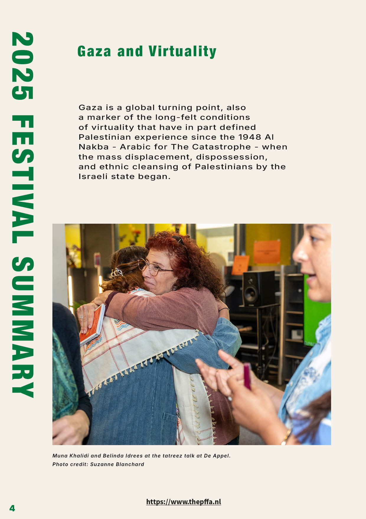
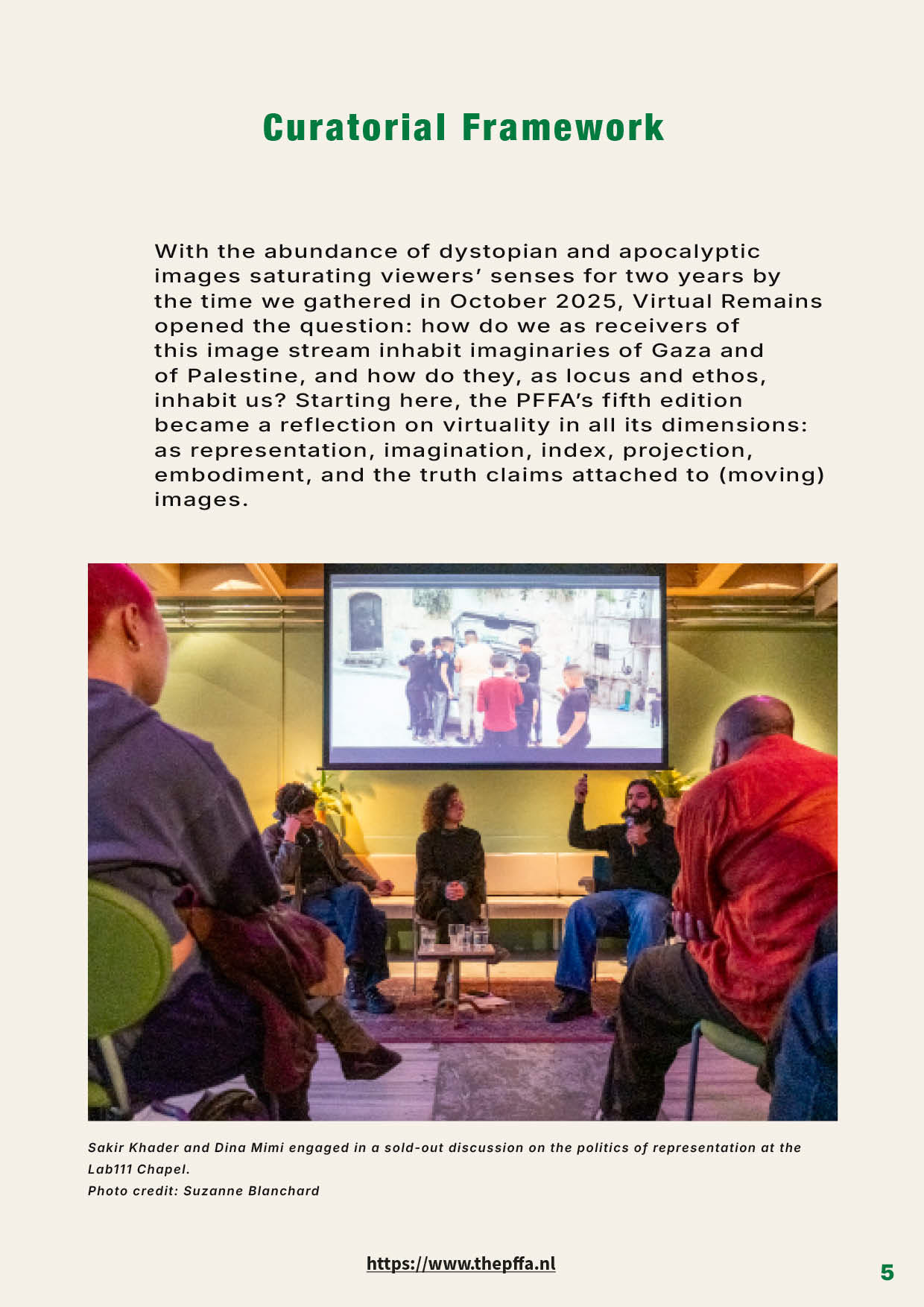
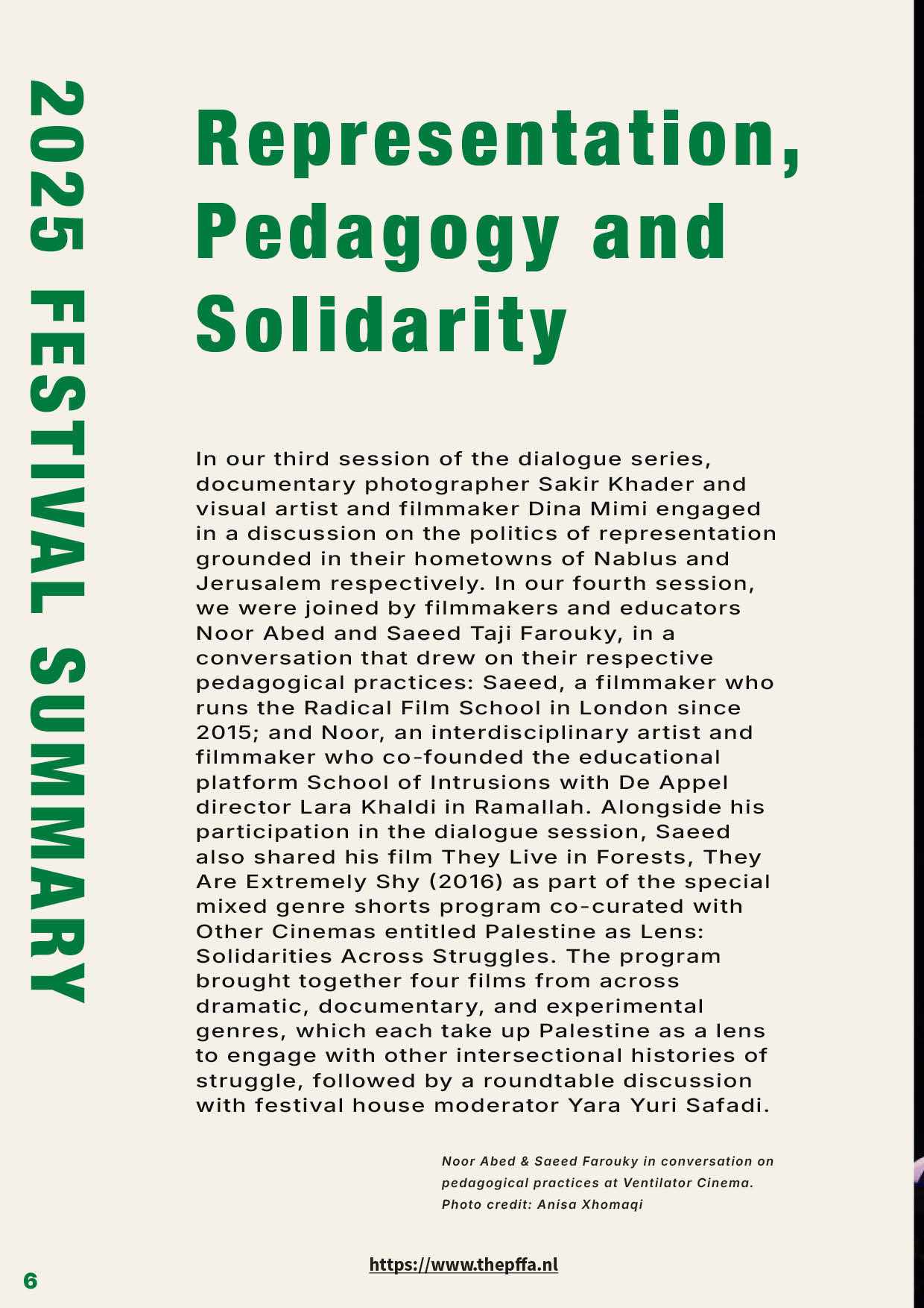
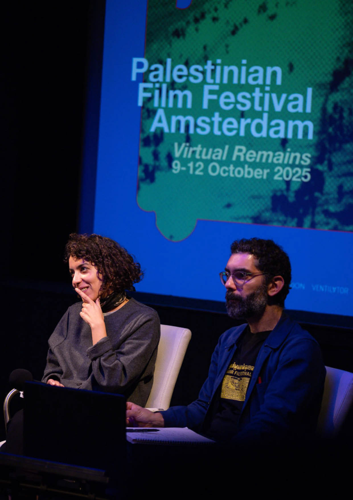
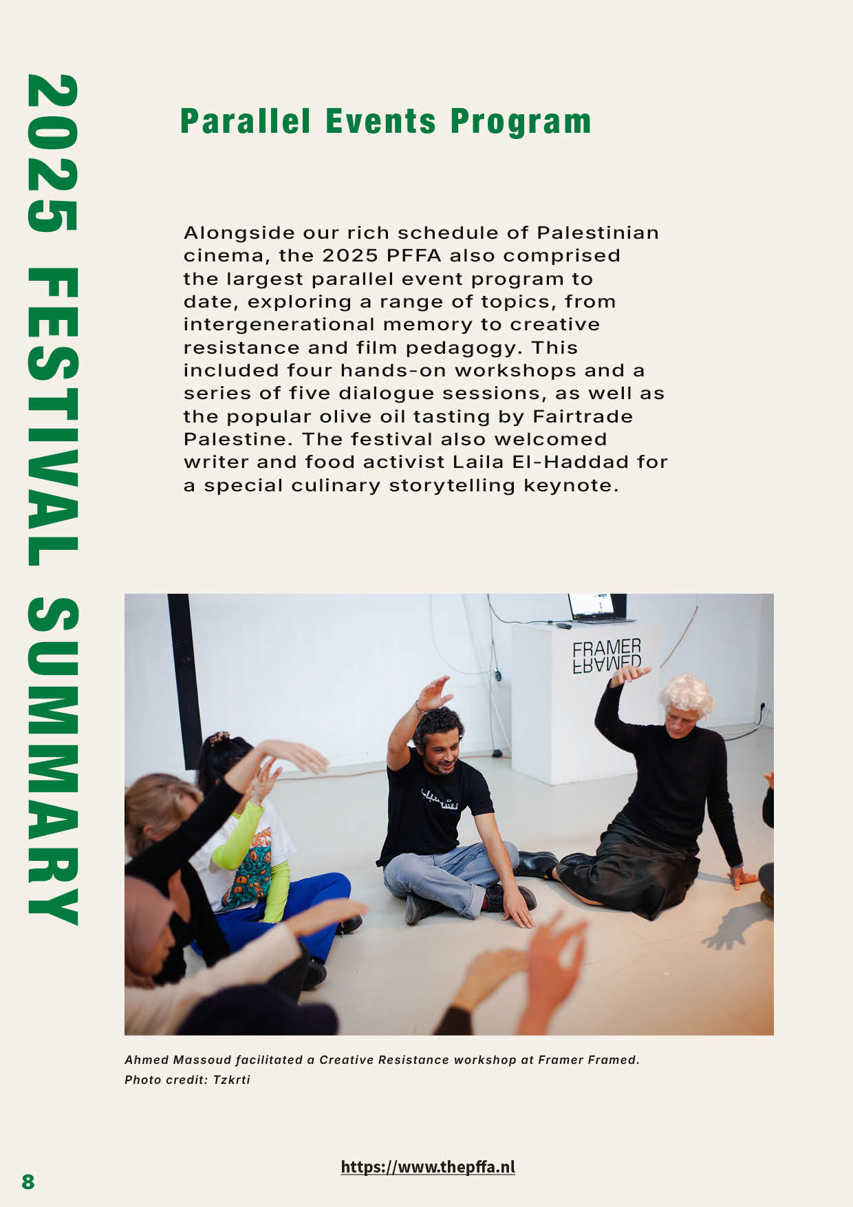
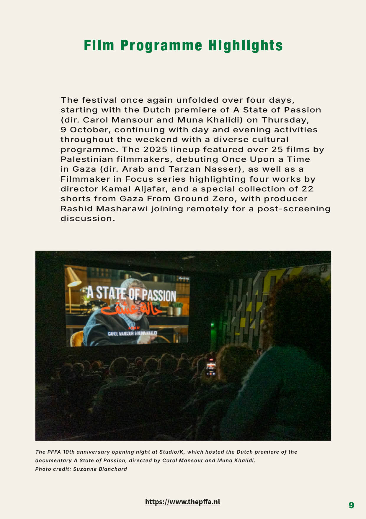
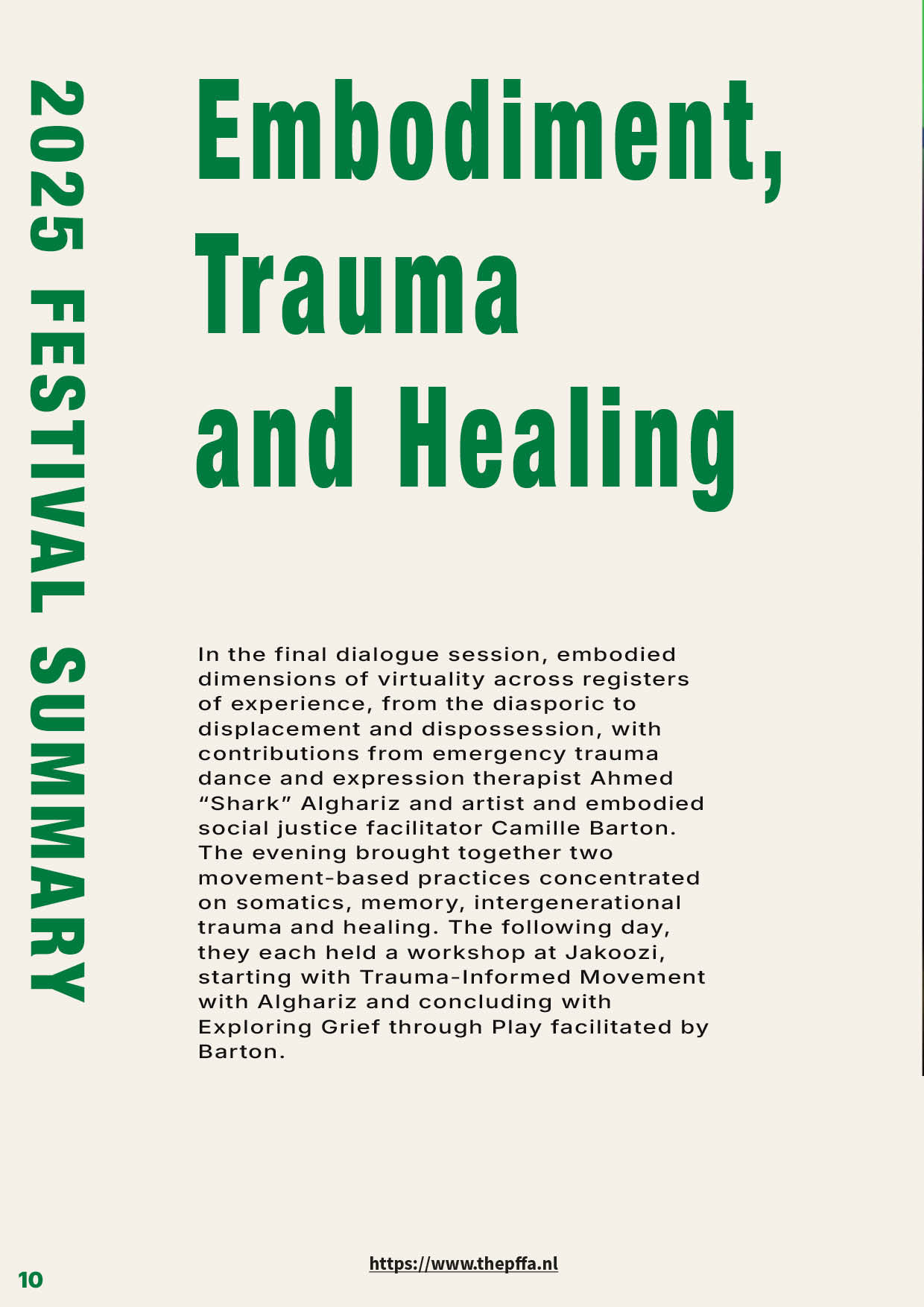
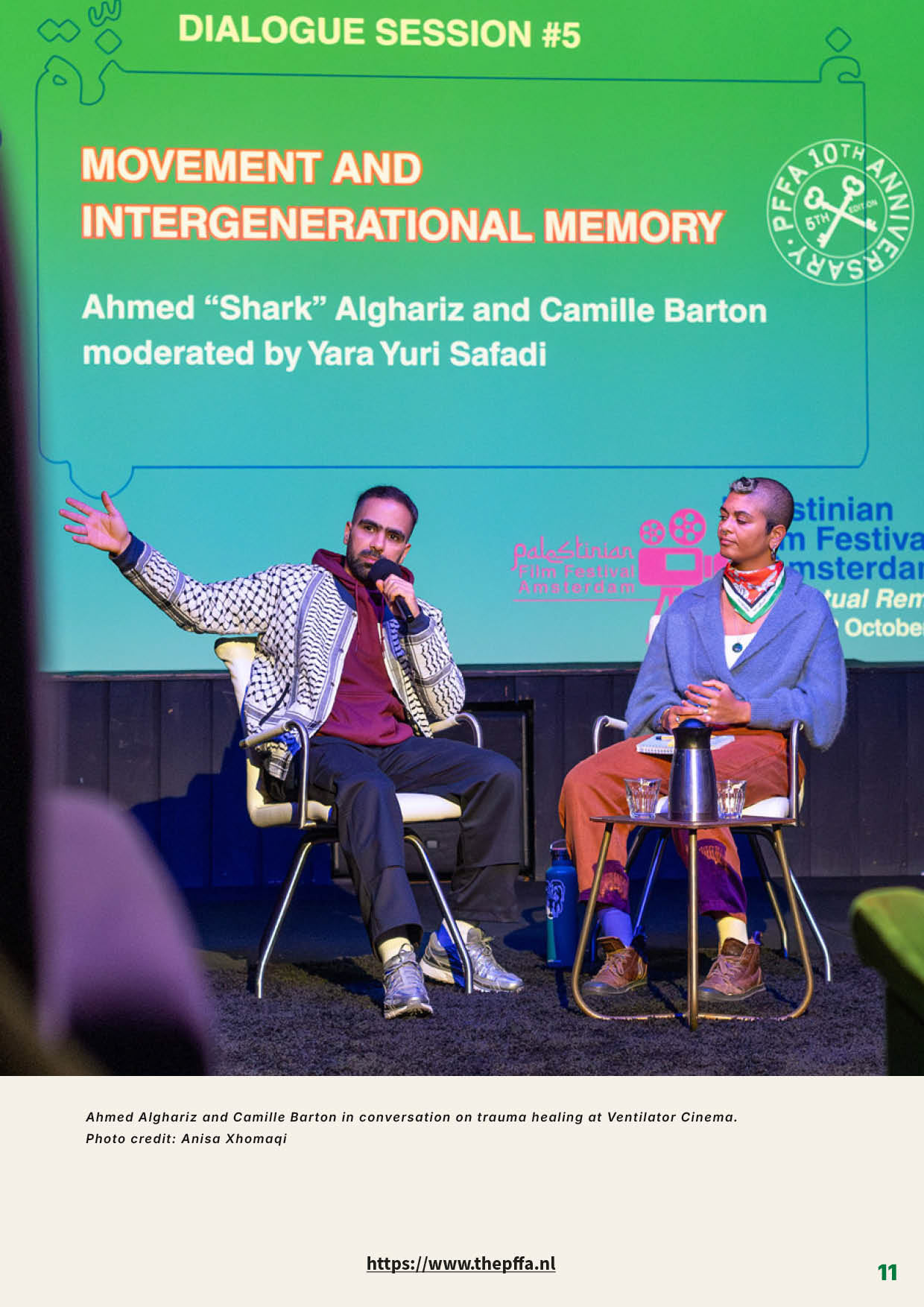
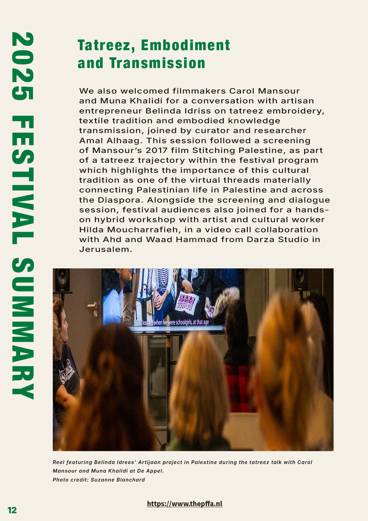
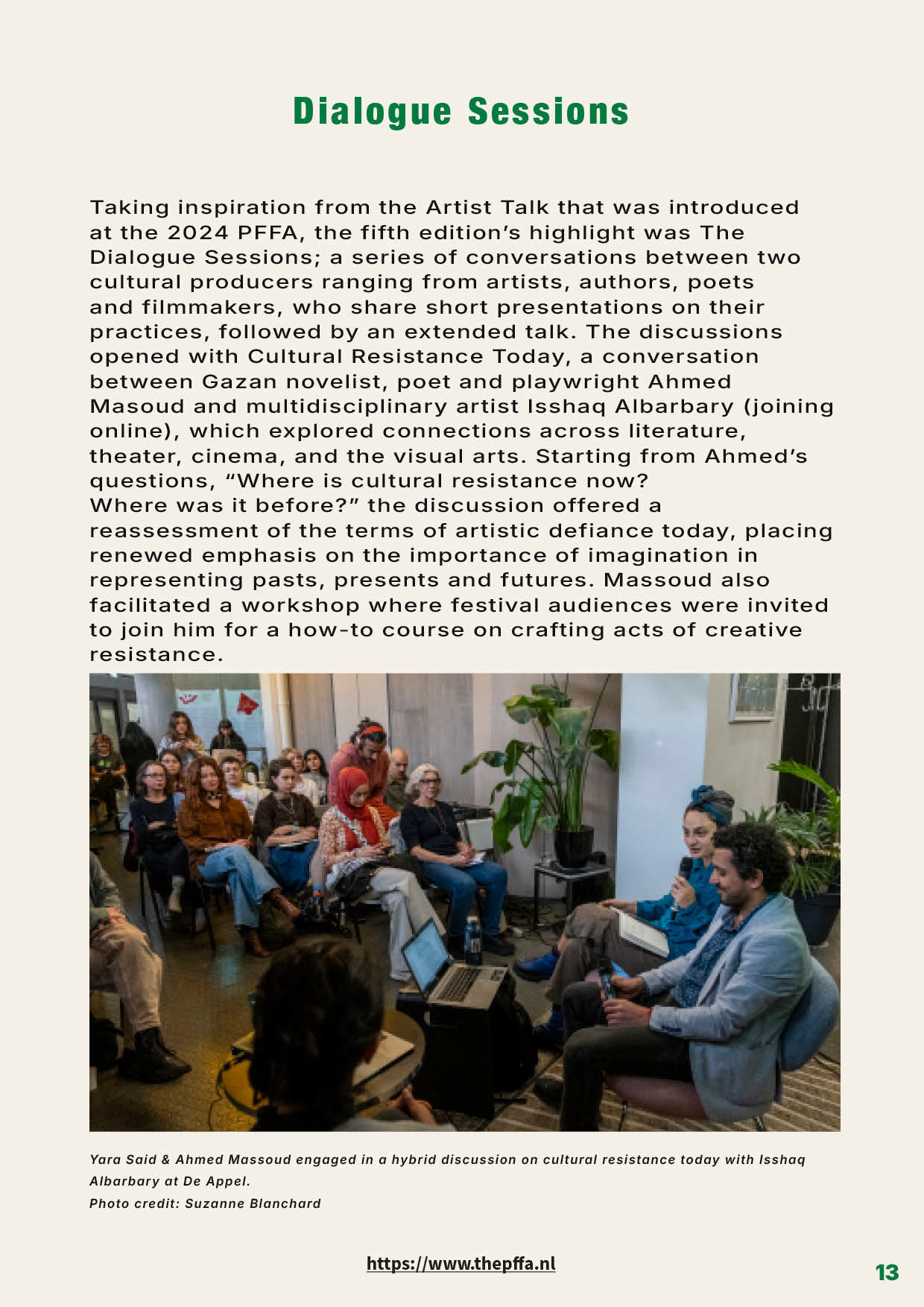
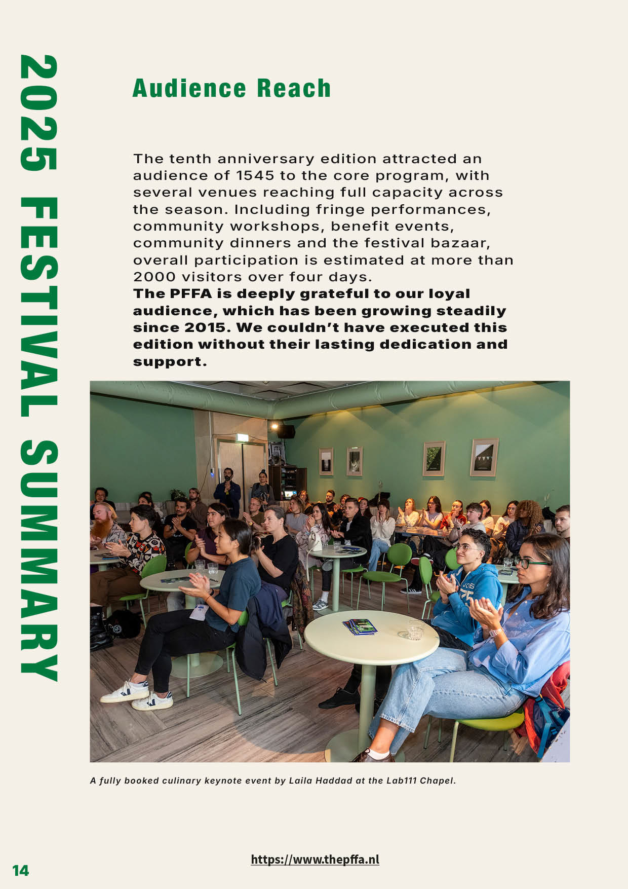
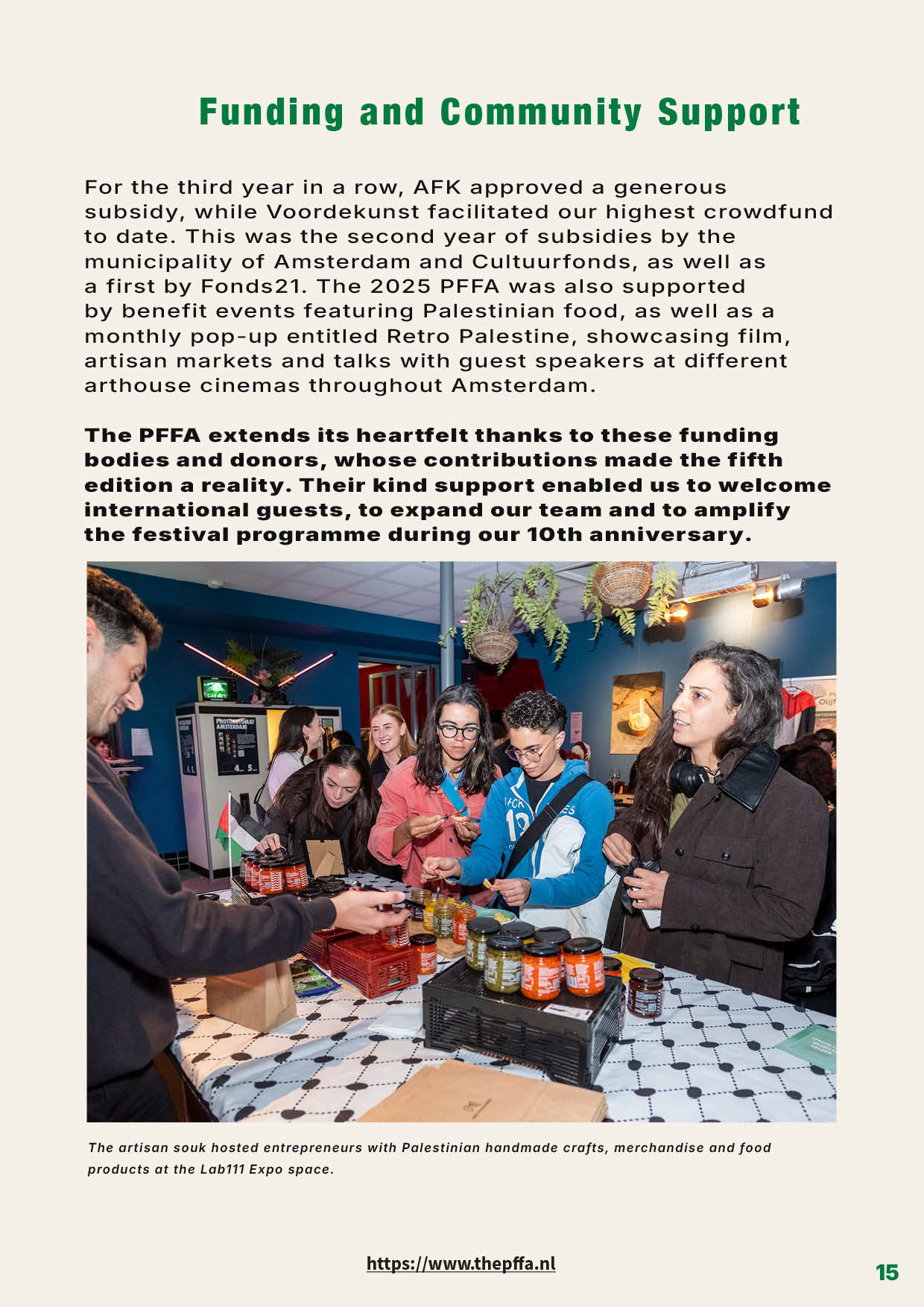
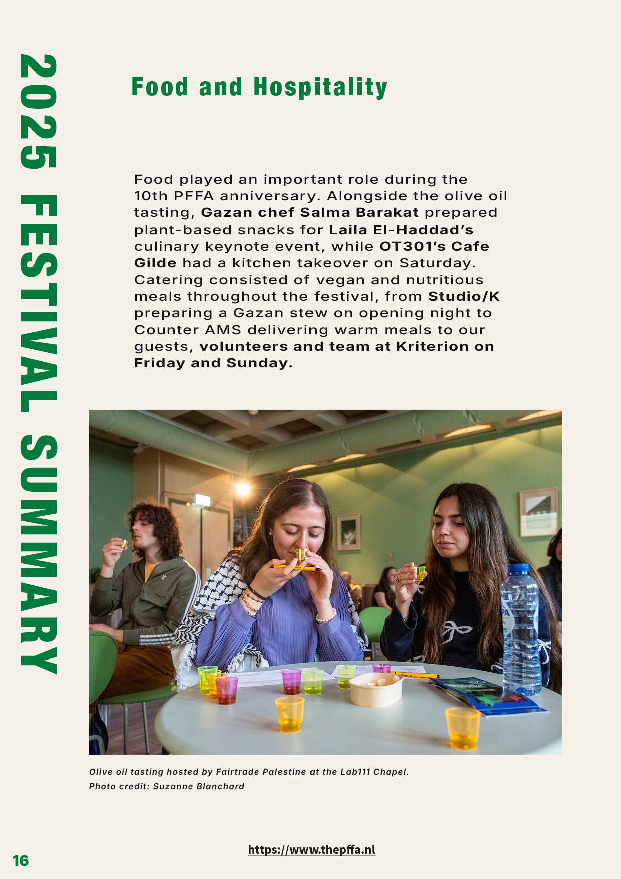
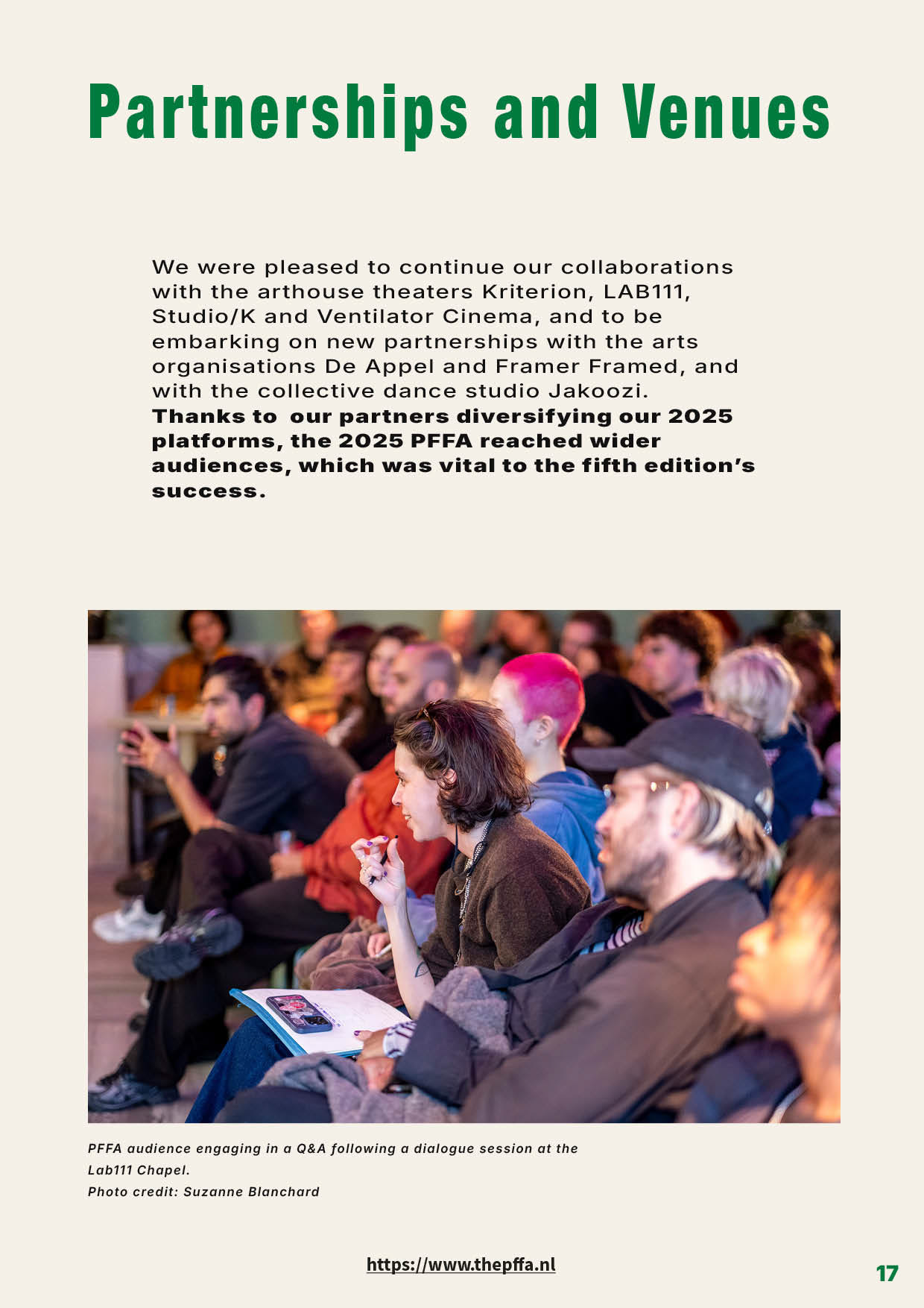
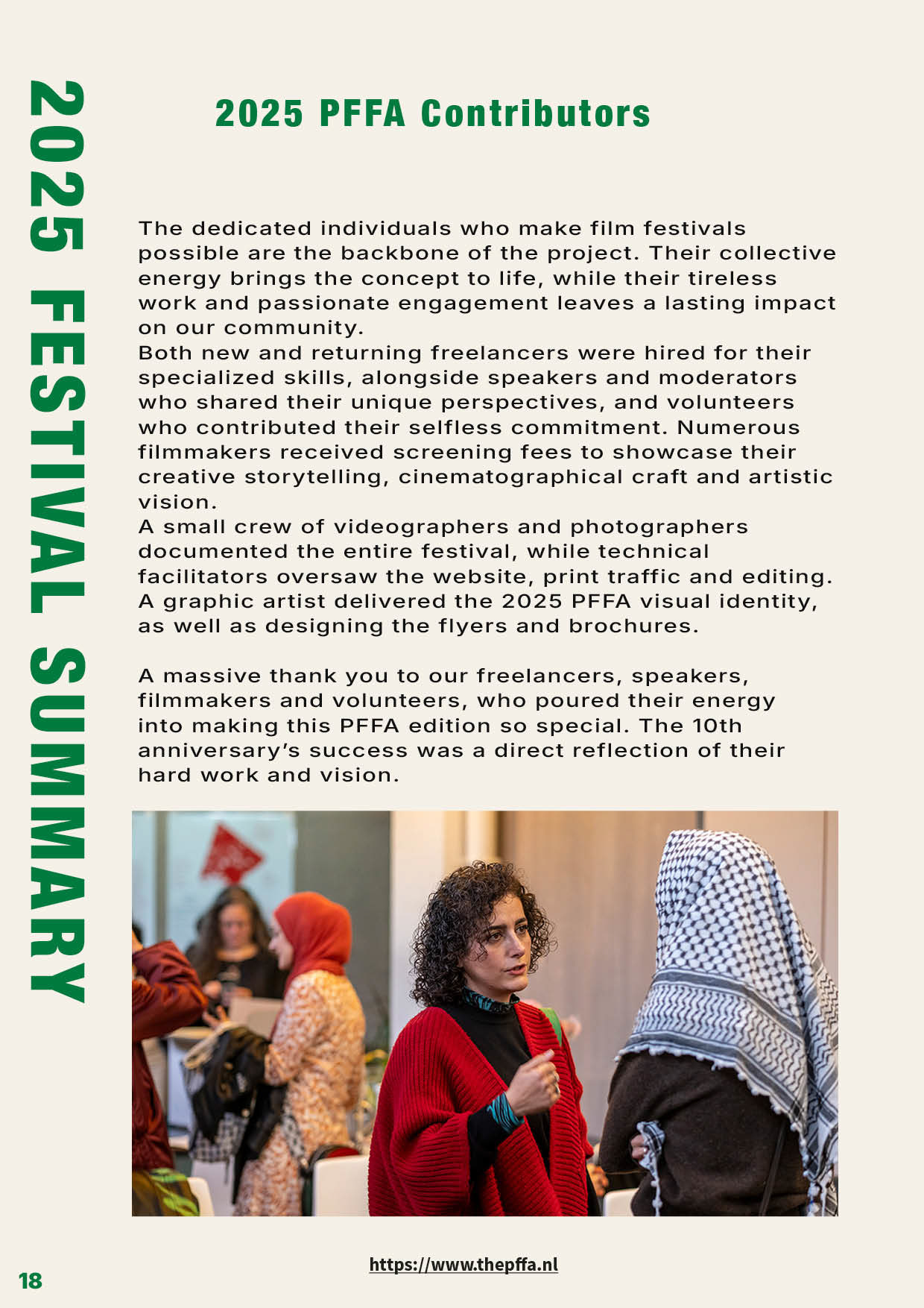
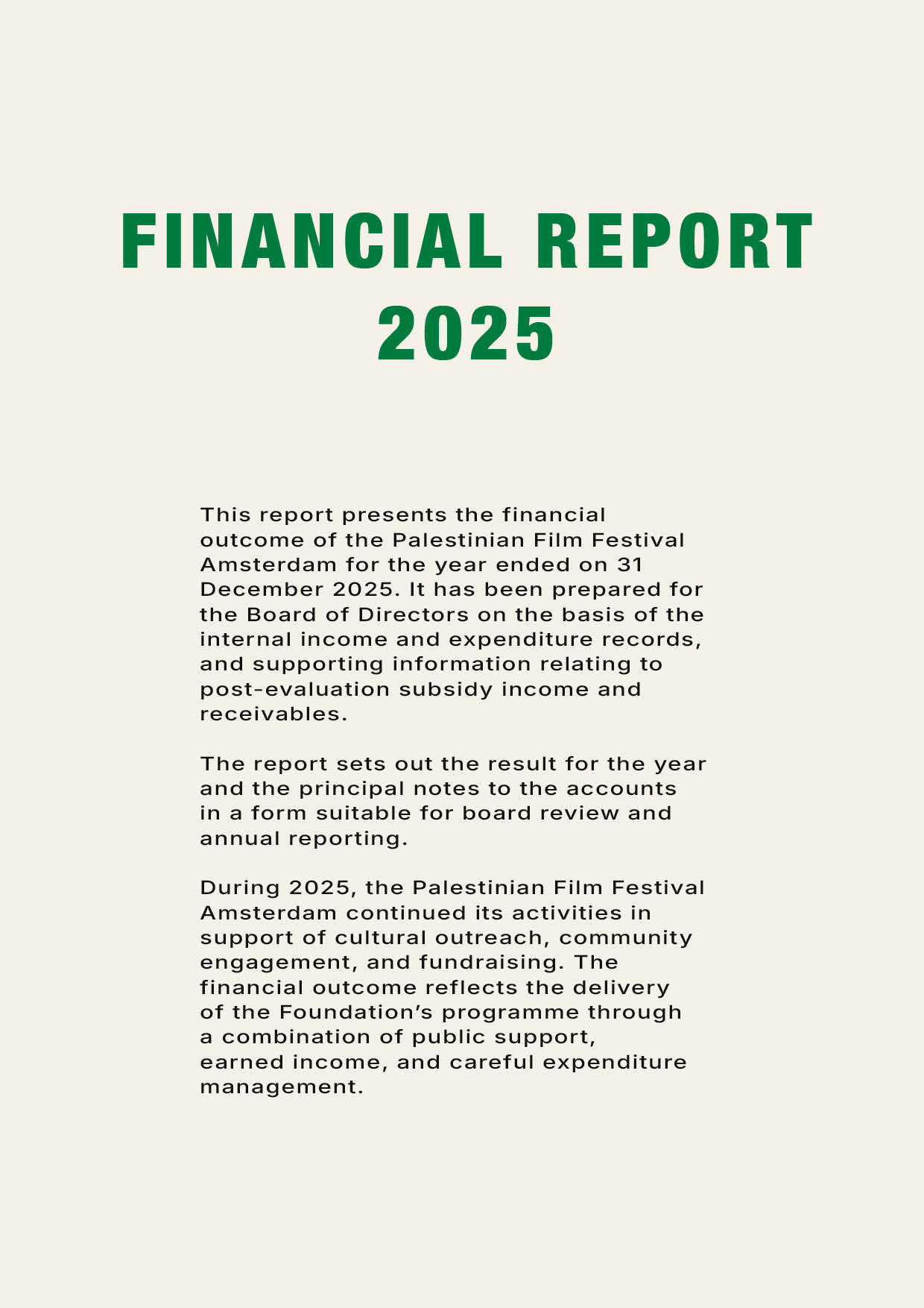
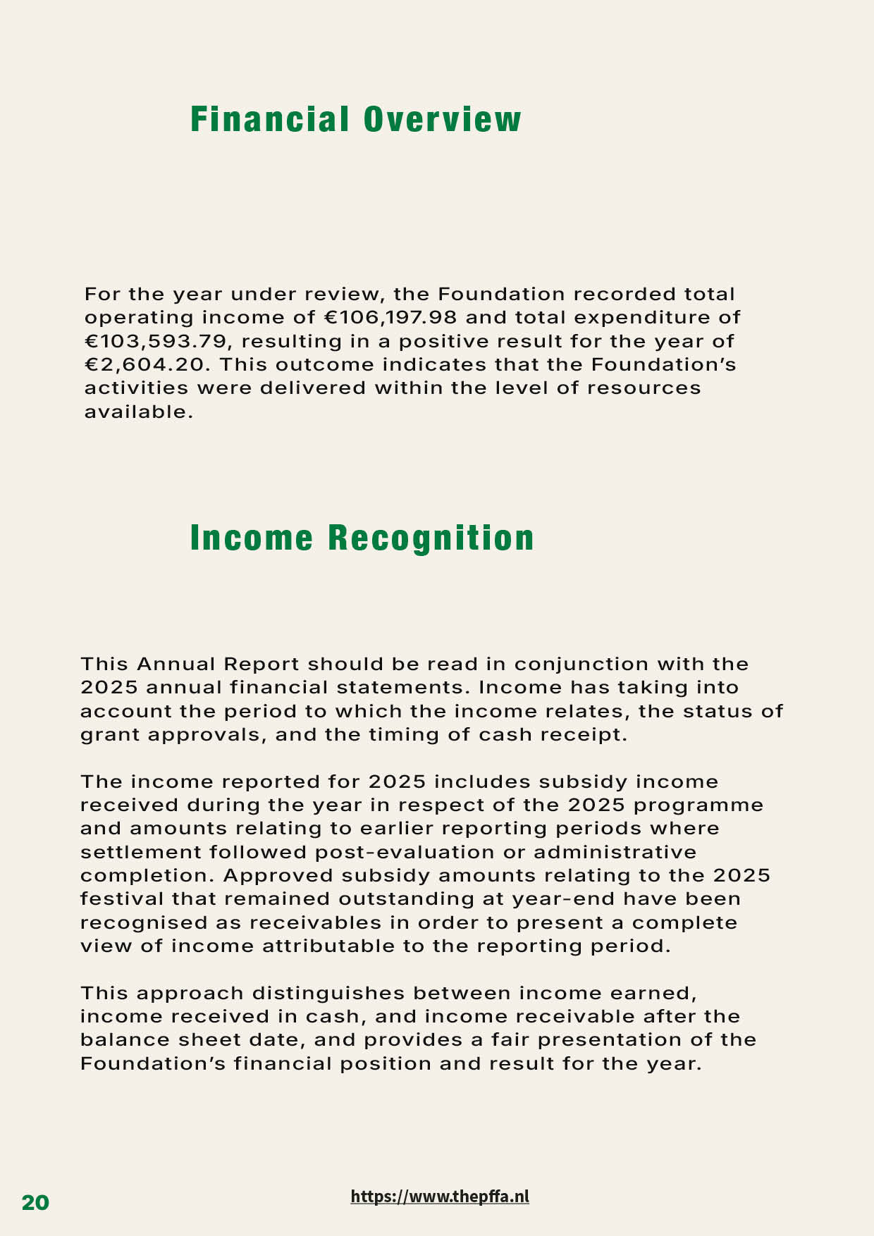
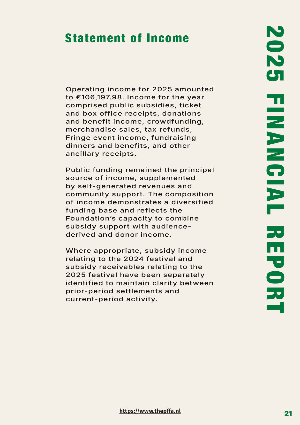
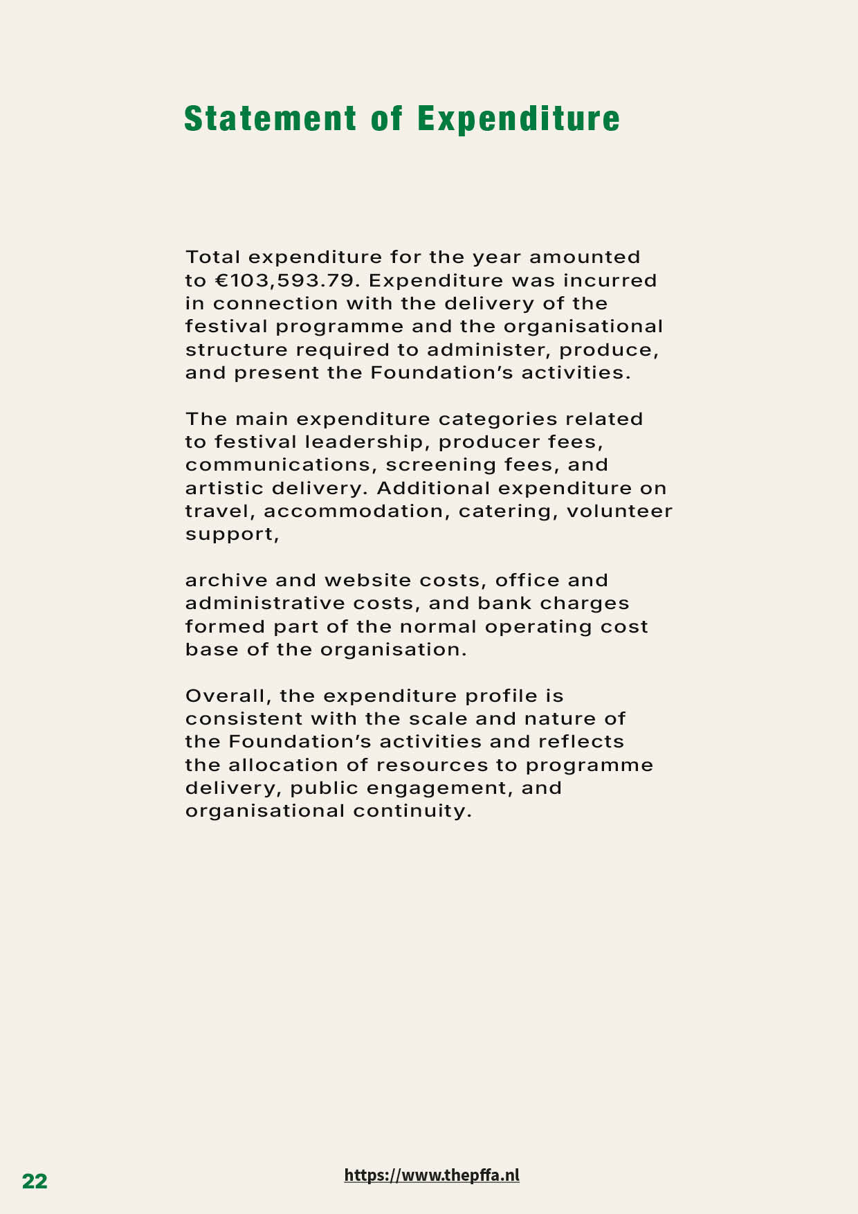
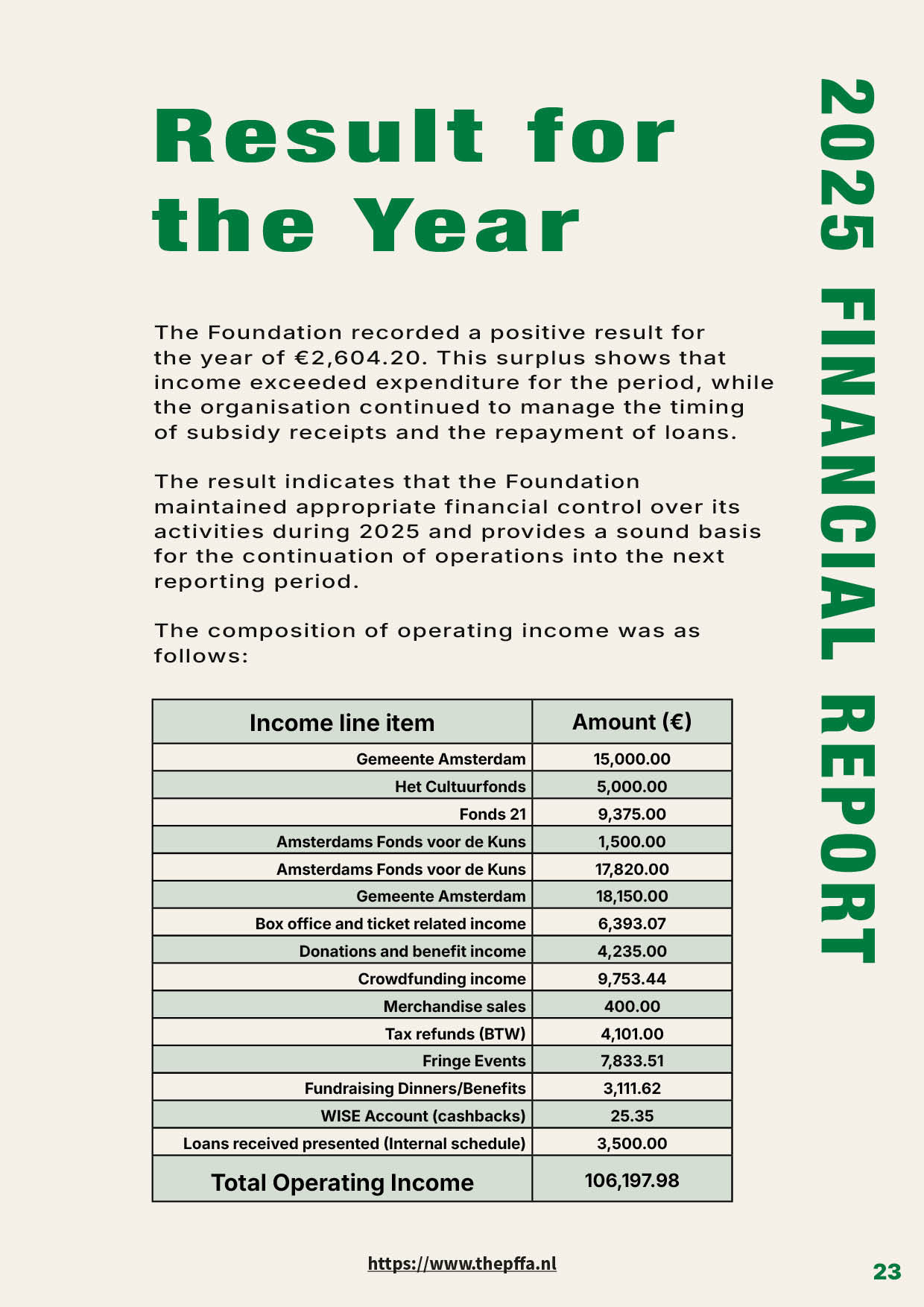
For the Palestinian Film Festival Amsterdam (PFFA), I designed a 24-page Annual Report documenting the festival’s 2025 edition, Virtual Remains. The project involved the complete editorial design and layout of the publication, including typographic hierarchy, grid system development, image placement, page composition, and the organization of extensive textual and financial content into a clear and engaging format.
The challenge was to create a professional and visually balanced report that reflects the festival’s cultural identity while maintaining the clarity and structure expected from an institutional annual publication. The report combines festival documentation, program highlights, audience impact, partnerships, and financial reporting within a cohesive editorial design system.
The publication was designed in Adobe InDesign, with image preparation and visual refinements completed in Adobe Photoshop. The cover image was created using AI-generated imagery and subsequently refined, retouched, and integrated into the final design in Photoshop to align with the visual identity of the festival.
Services:
— Editorial Design
— Annual Report Design
— Publication Design
— Layout Design
— Typography & Grid Systems
— Editing and Art Direction
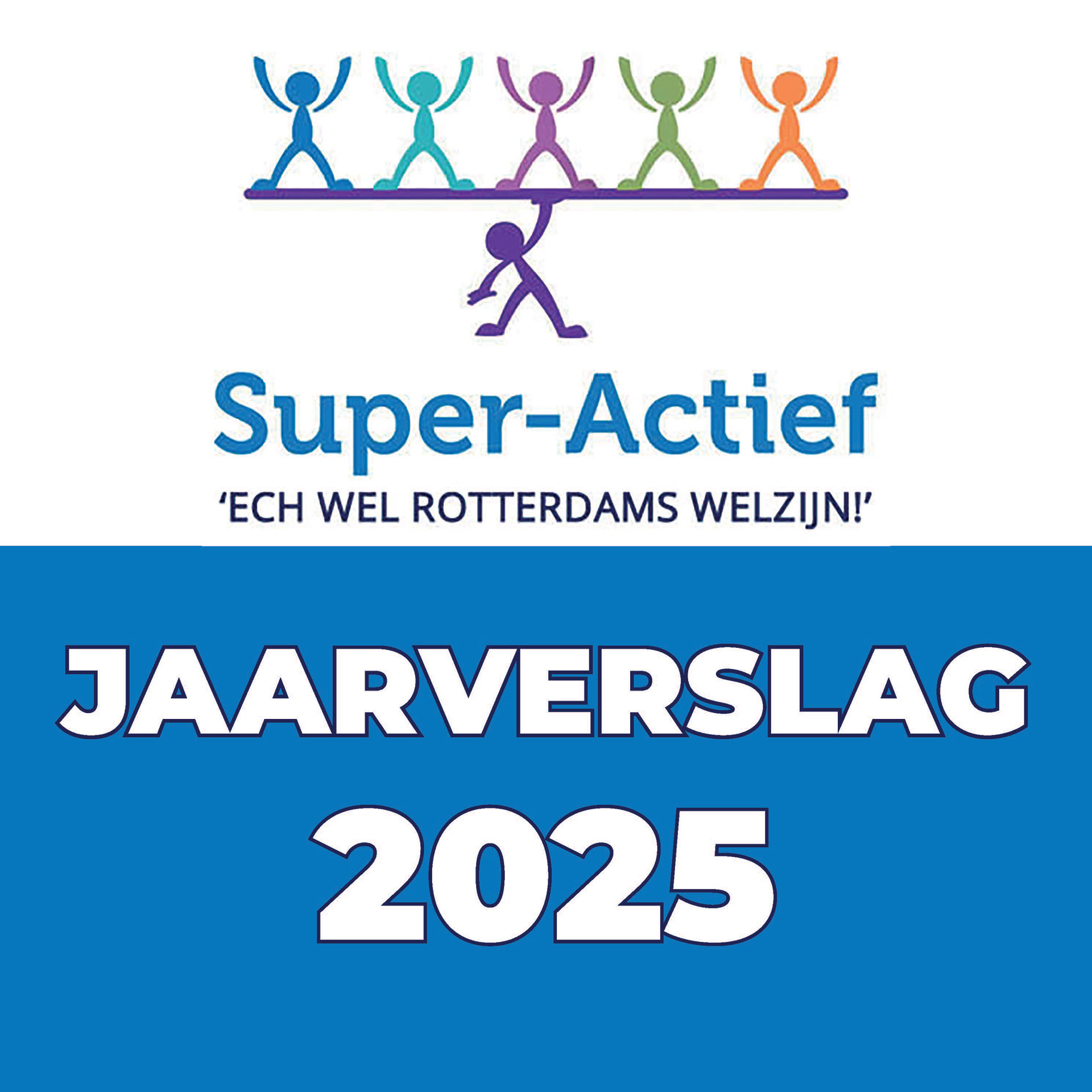
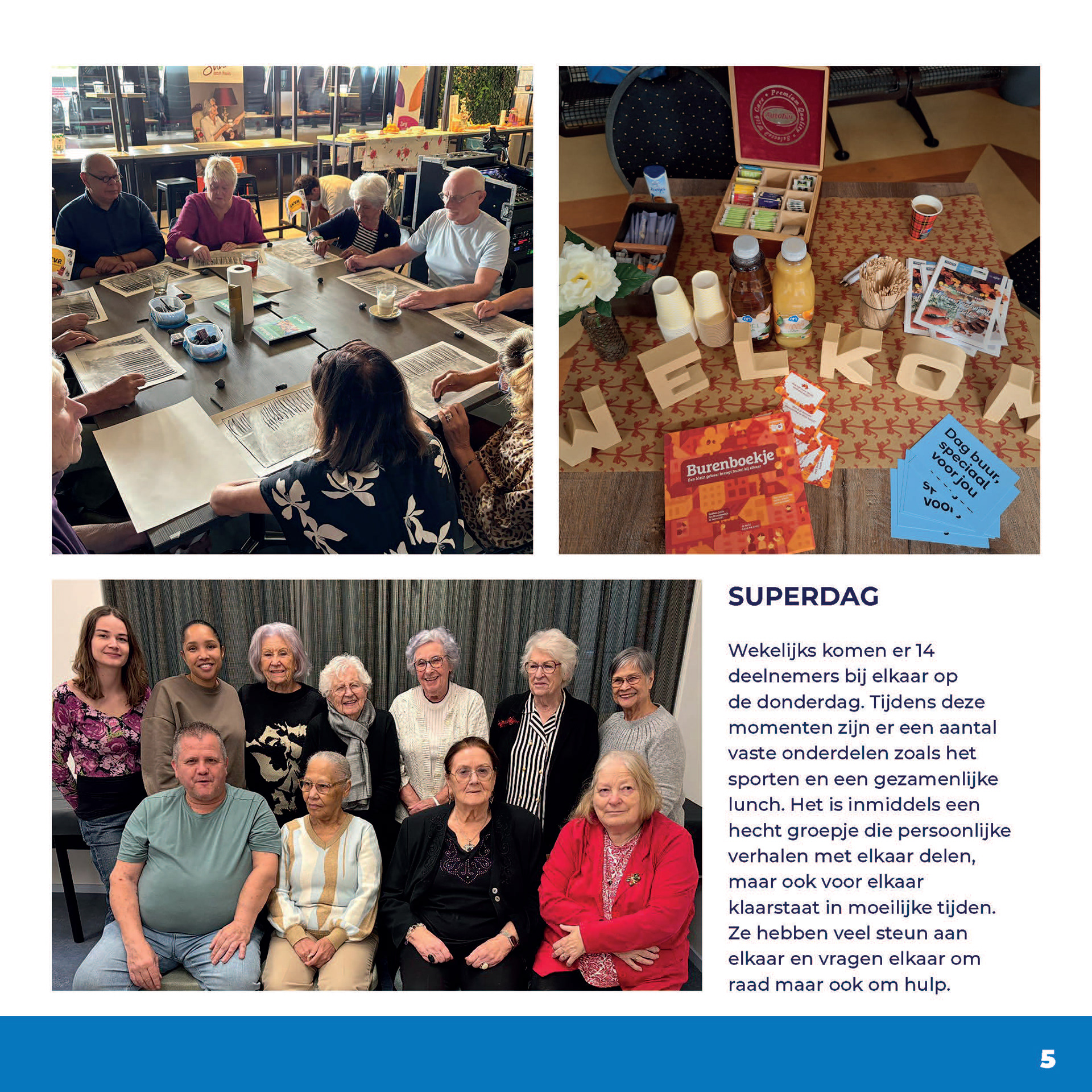
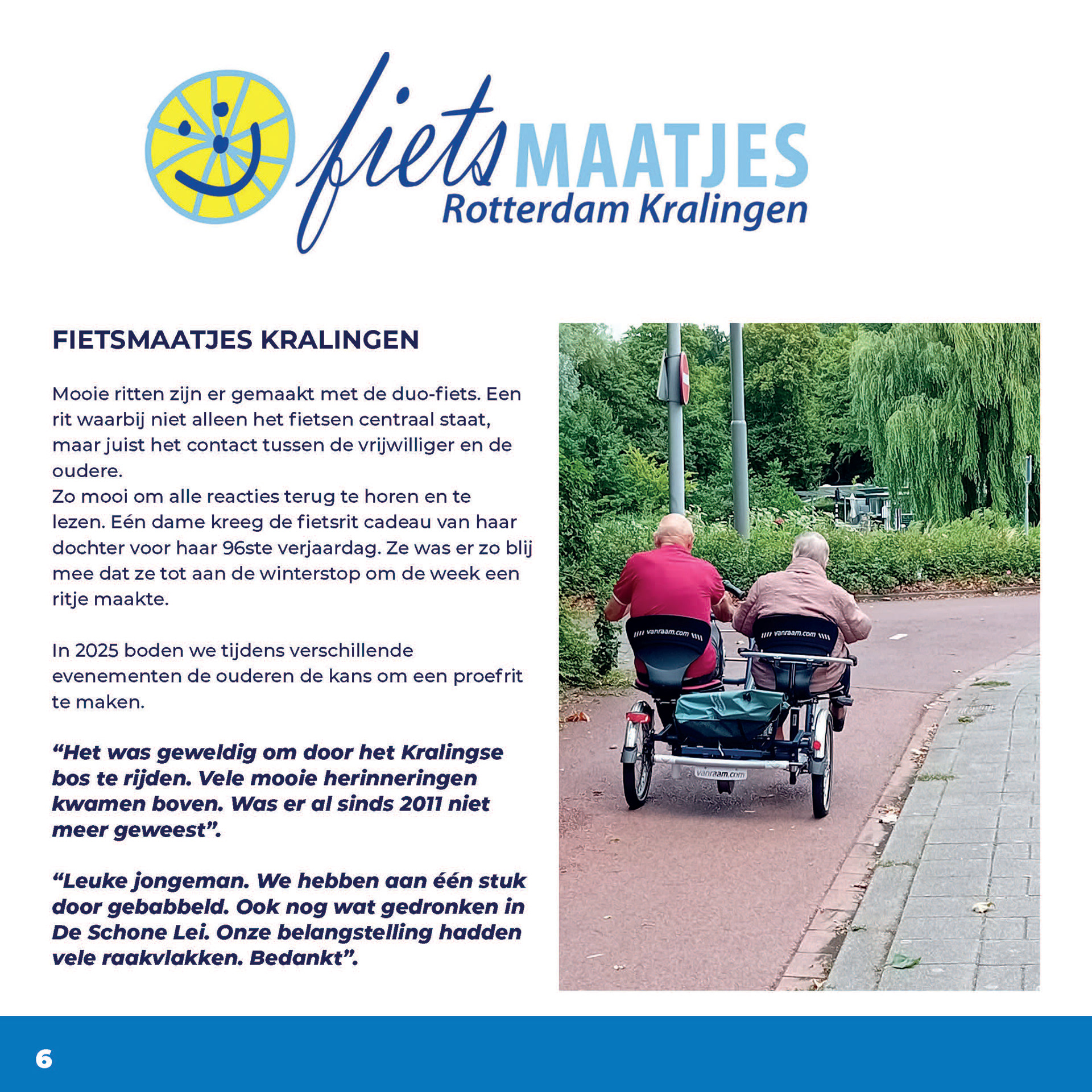
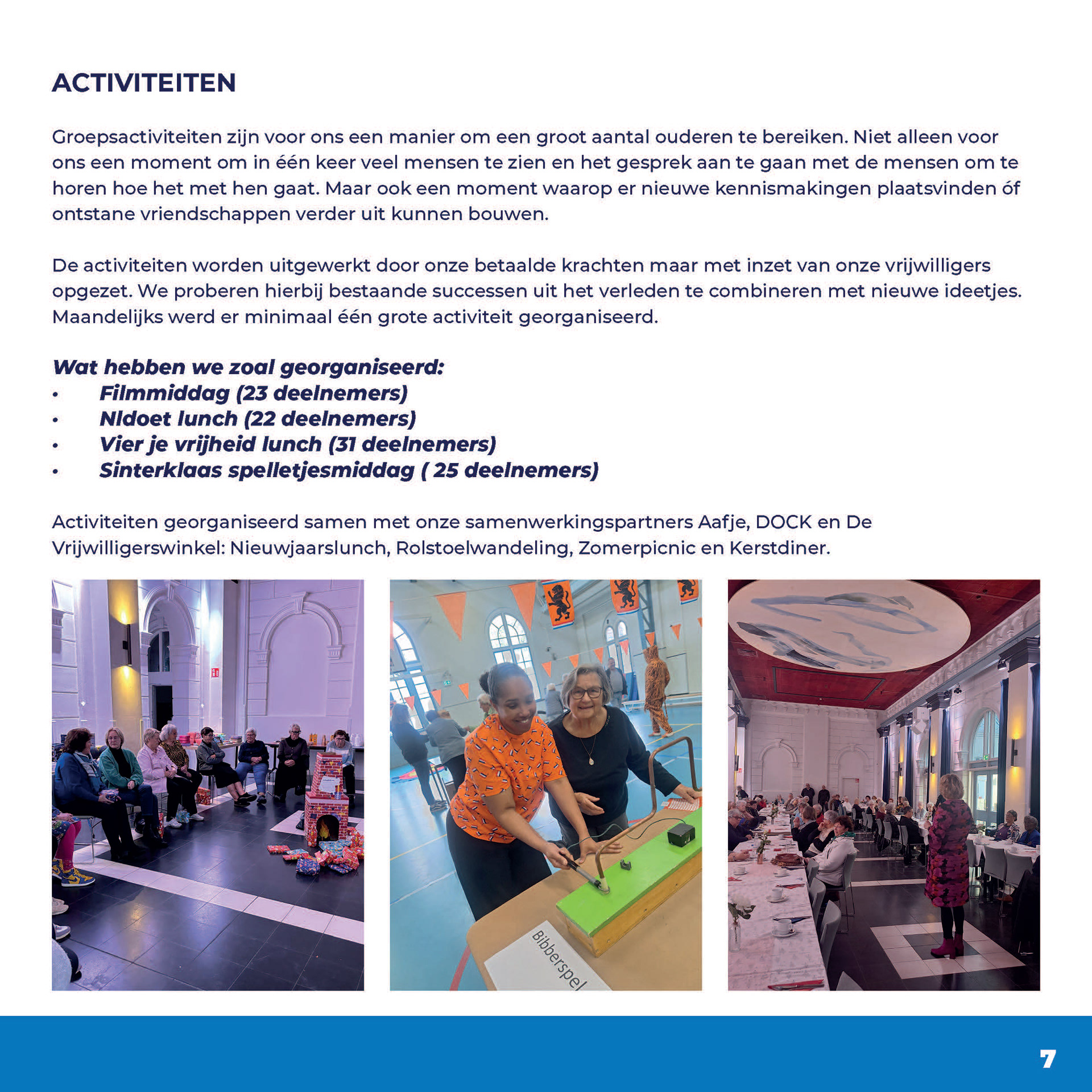
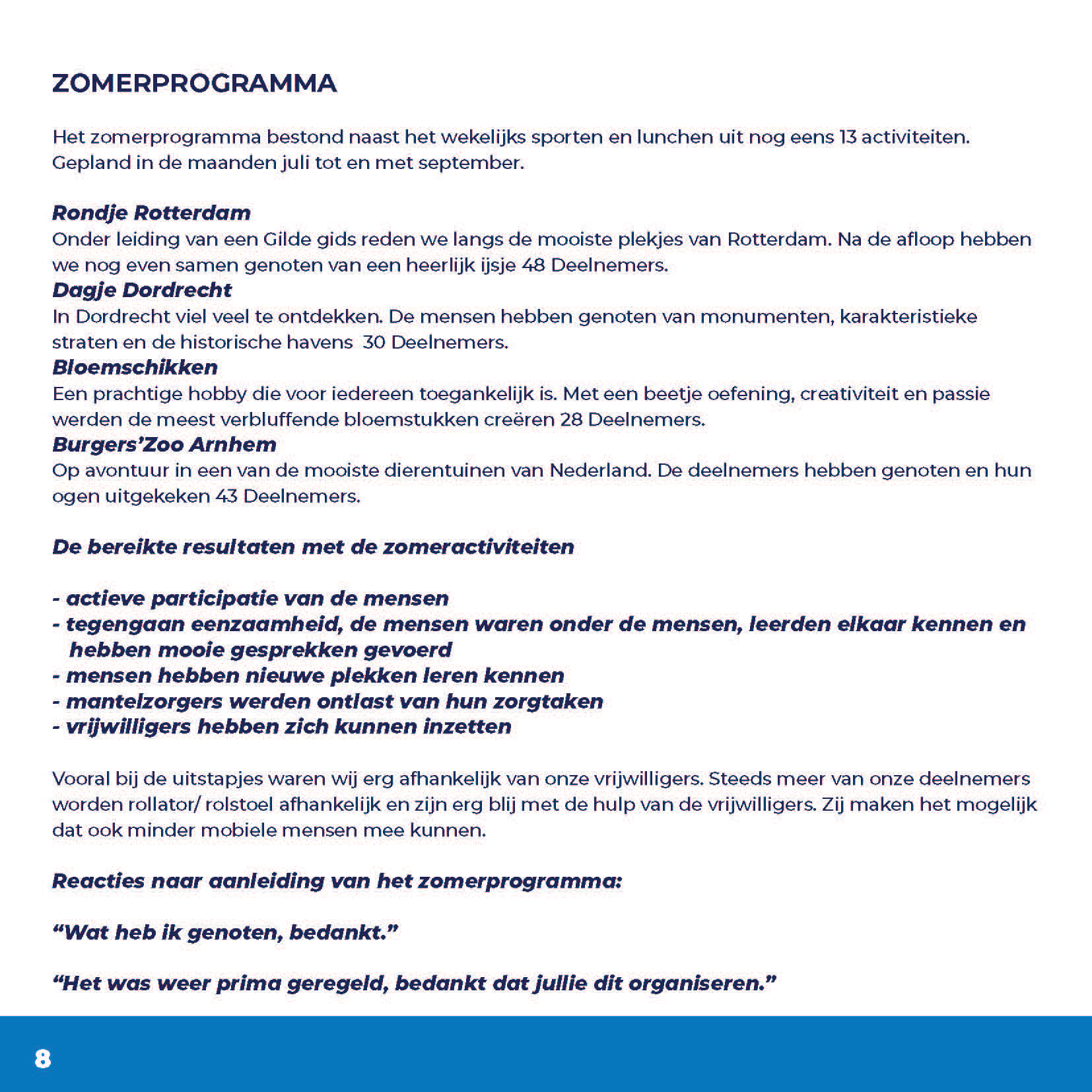
Super-Actief Annual Bulletin 2025
Editorial Design / Print & Digital
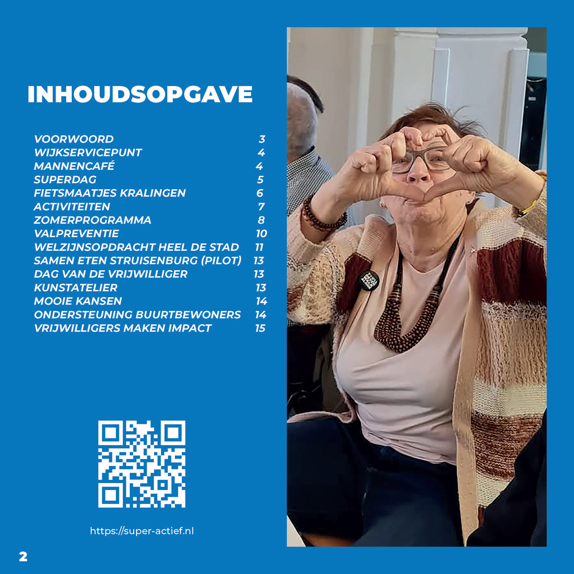
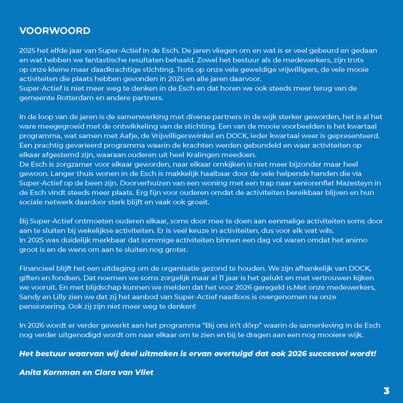
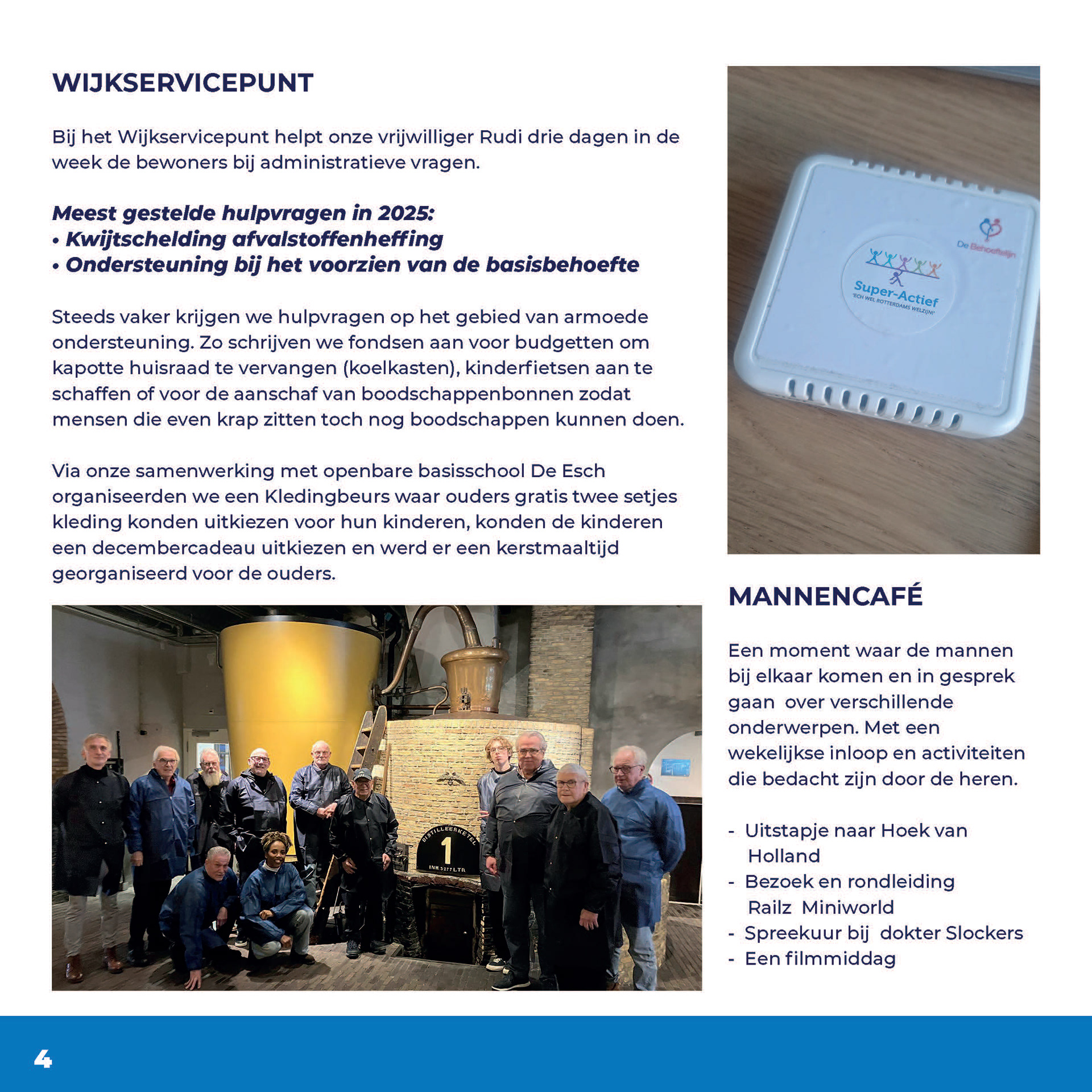
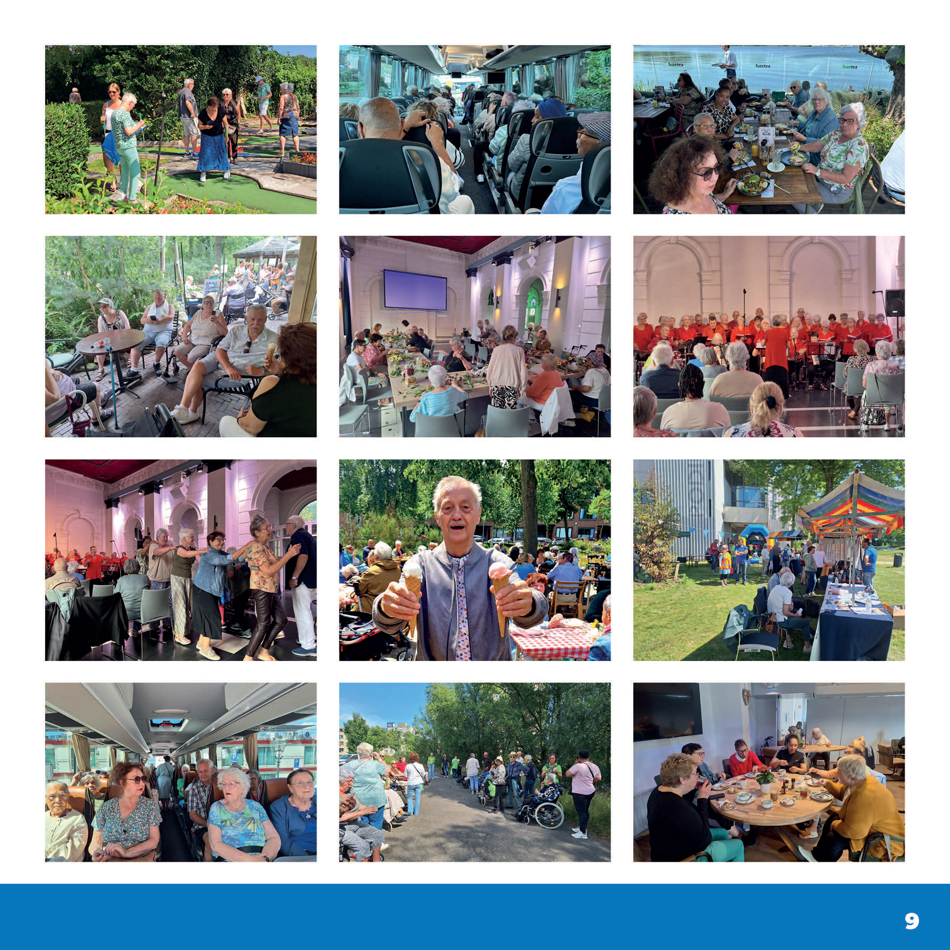
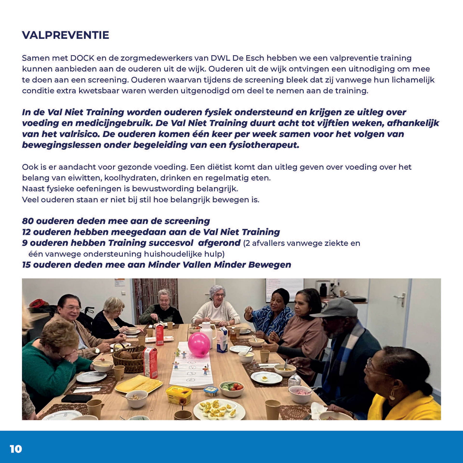
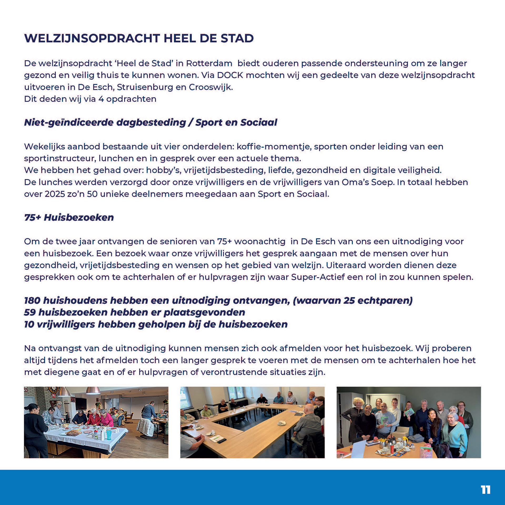
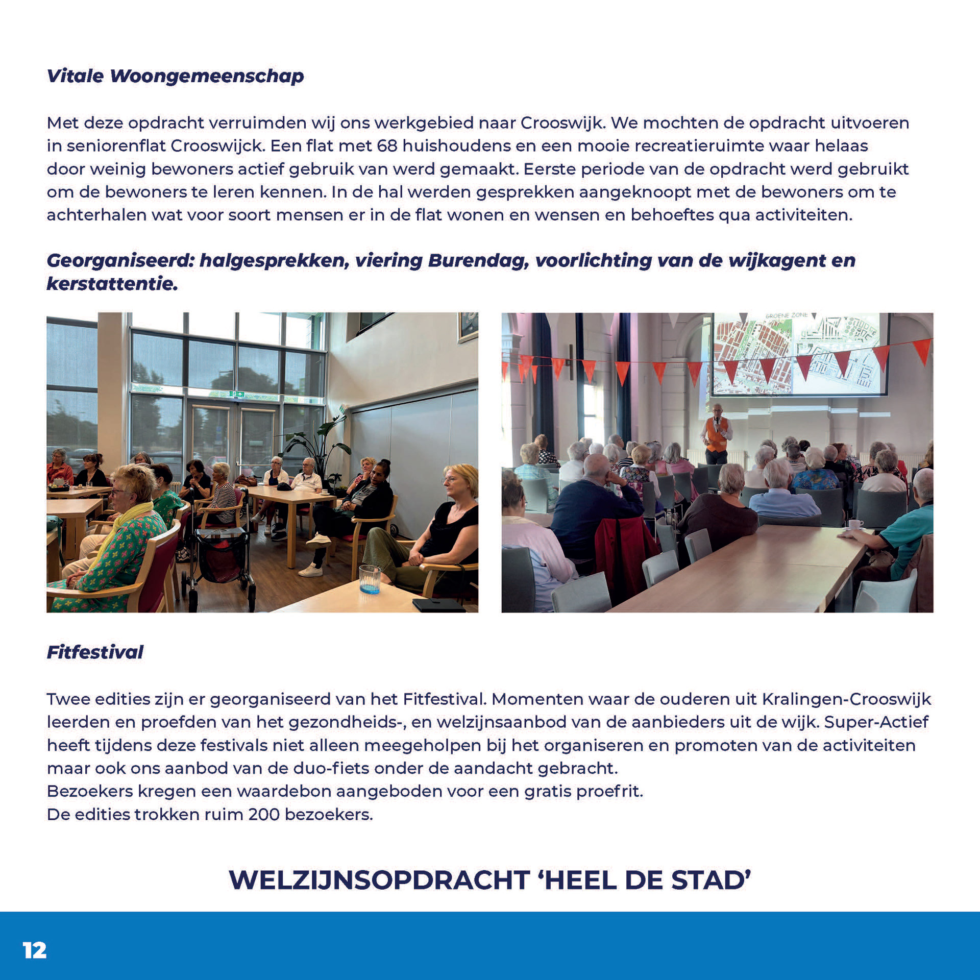
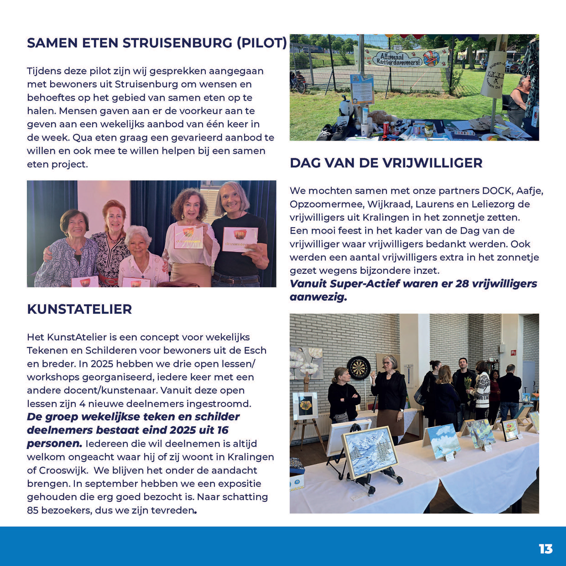
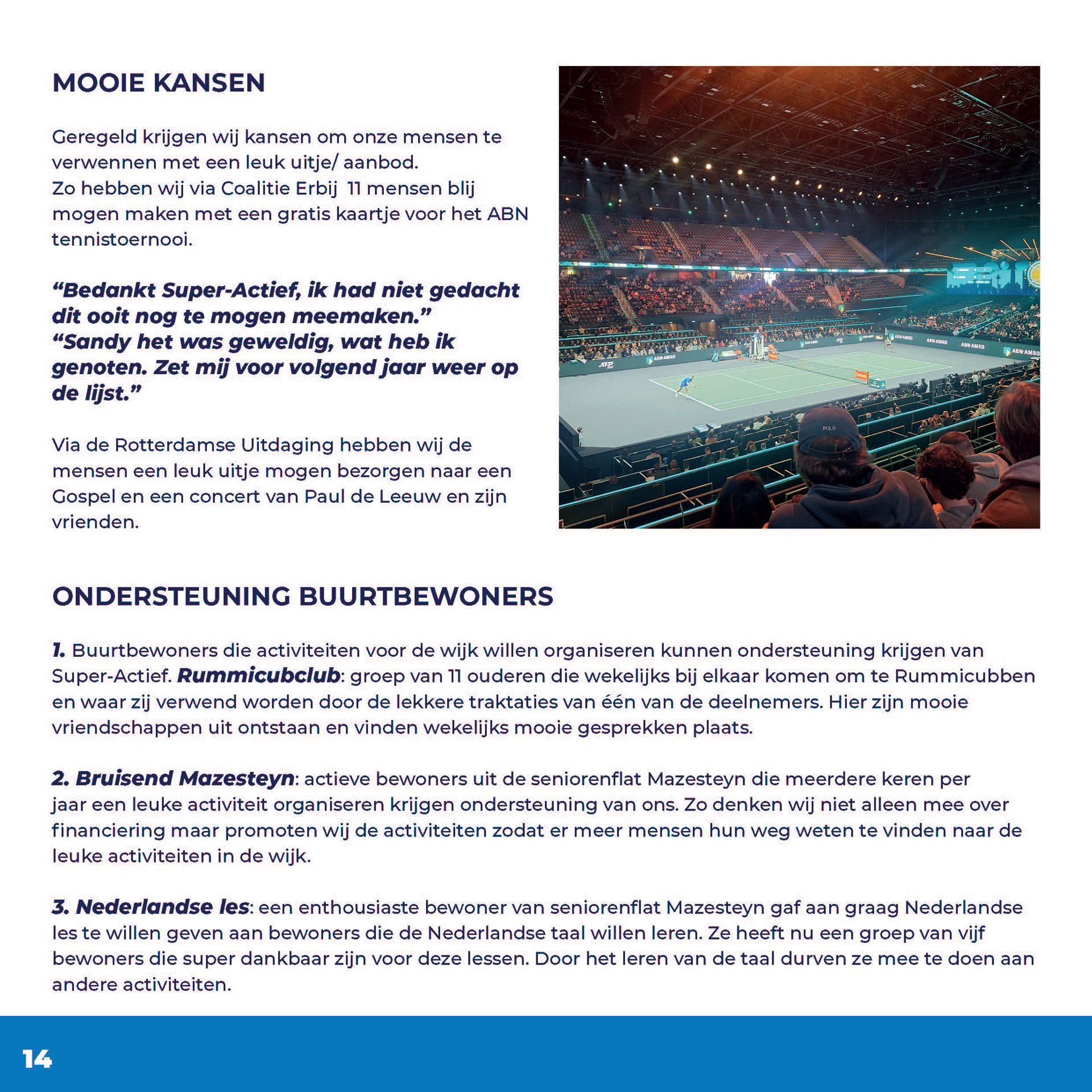
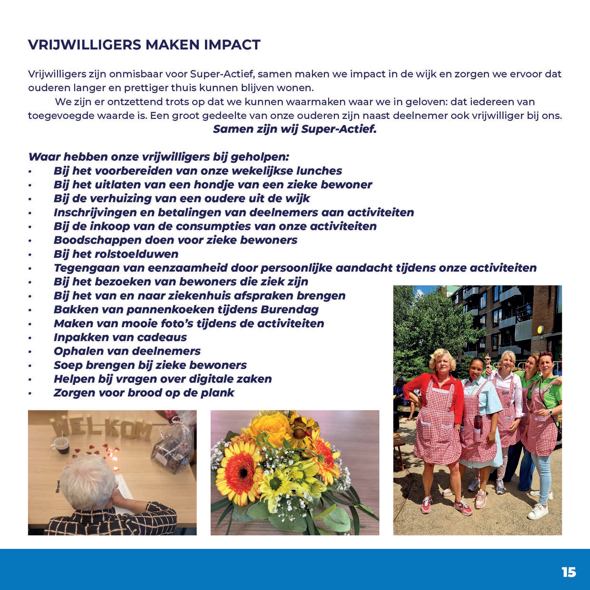
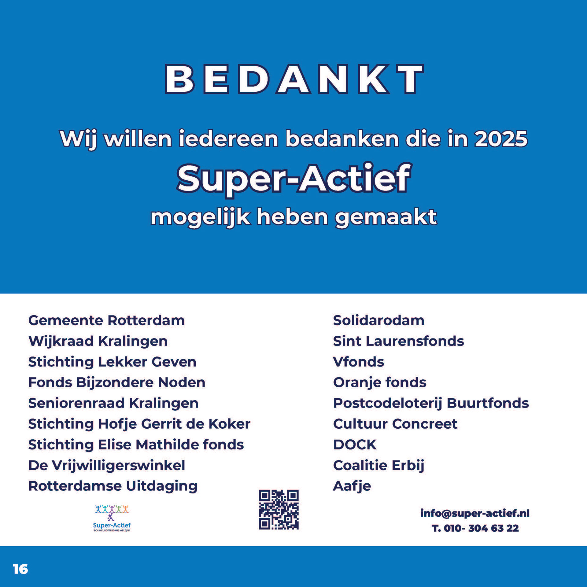
For Super-Actief, a Rotterdam-based organization supporting community-driven social initiatives, I developed the concept, editorial structure, and complete visual design for their 2025 annual bulletin.
Working across both print and digital formats, I created a balanced 210 × 210 mm publication system with a clear editorial flow and cohesive visual language. One of the main challenges was bringing together photography from multiple contributors and creating consistency across diverse images. Through image editing, layout decisions, and a refined visual system inspired by Super-Actief’s blue identity, I designed a calm and unified publication that reflects the organization’s values.
Responsibilities:
— Editorial concept & structure
— Layout design
— Image editing & visual consistency
— Print & digital publication design
— Editorial concept & structure
— Layout design
— Image editing & visual consistency
— Print & digital publication design
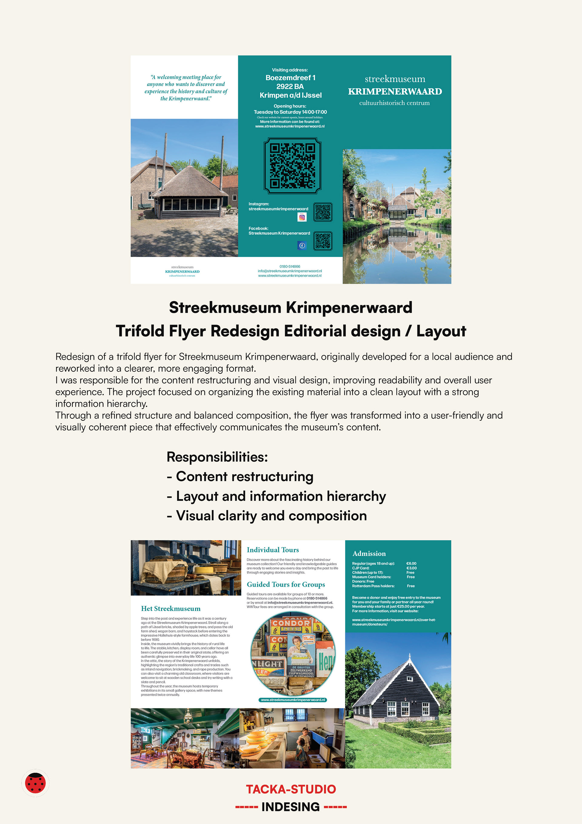
Content restructuring
Layout and information hierarchy
Visual clarity and composition
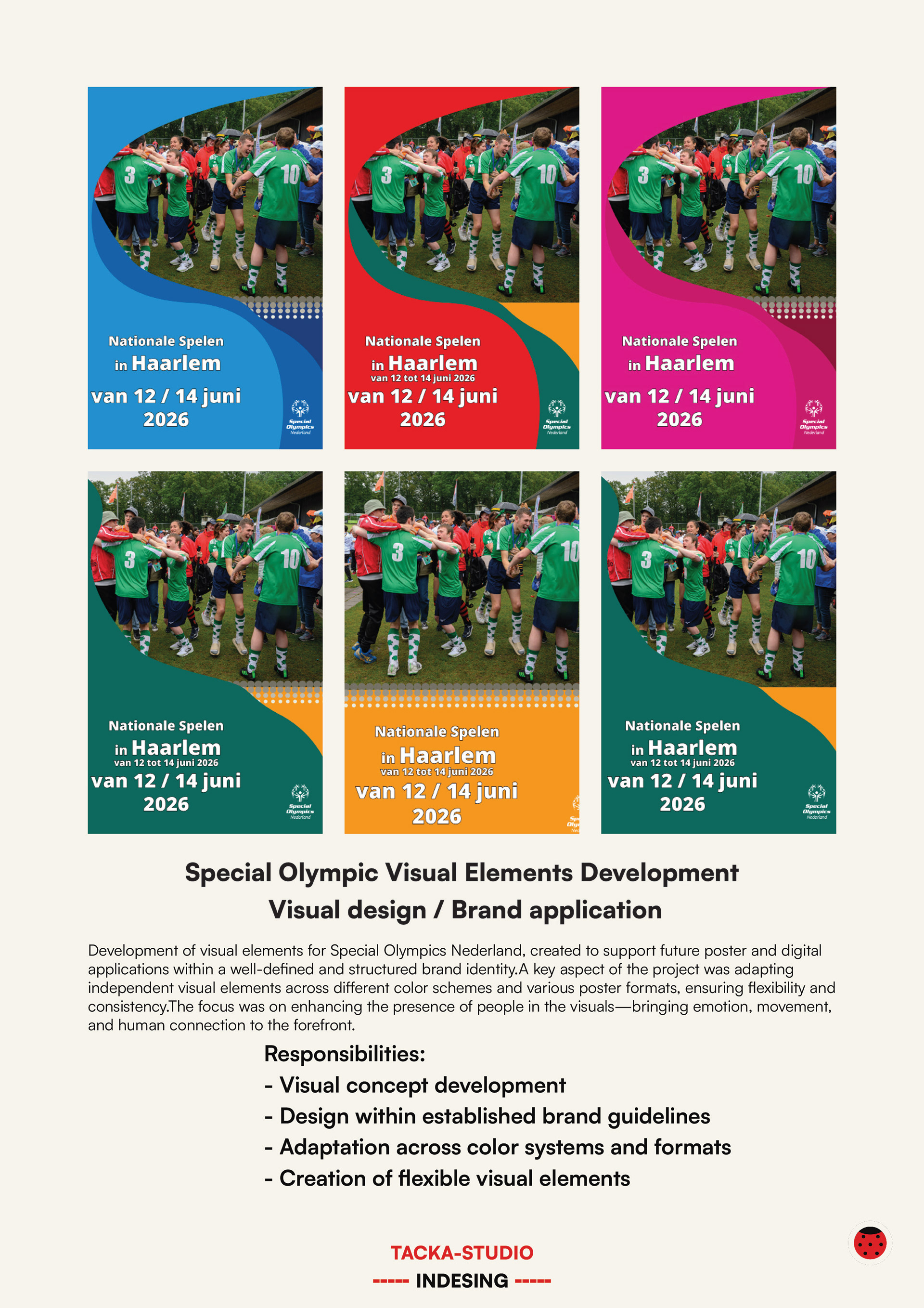
Visual concept development
Design within established brand guidelines
Adaptation across color systems and formats
Creation of flexible visual elemen
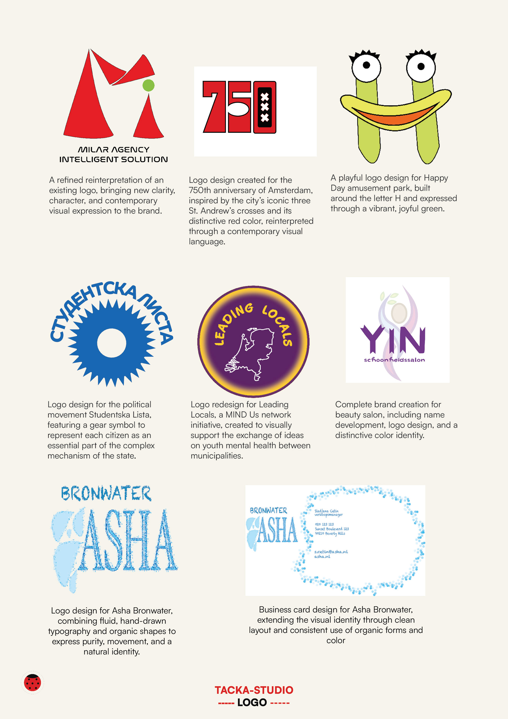
I create distinctive logos, icon systems and visual identities that help brands communicate clearly and consistently across print and digital platforms.
Each design is developed with a focus on simplicity, recognition and long-term usability, creating visual solutions that are both functional and memorable.